
A near-real-time roller-coaster of home sales during the pandemic via charts.
(Wolf Richter) On May 28, I reported how the National Association of Realtors’ Pending Home Sales Index for the US had plunged 34% in April. These are sales where contracts were signed in April, and were expected to close over the next month or two. The index gives a preview of what closed sales in May might look like. In the comments, some people said that sales in their bailiwick were jumping while others said that sales were slow. Real estate is local.
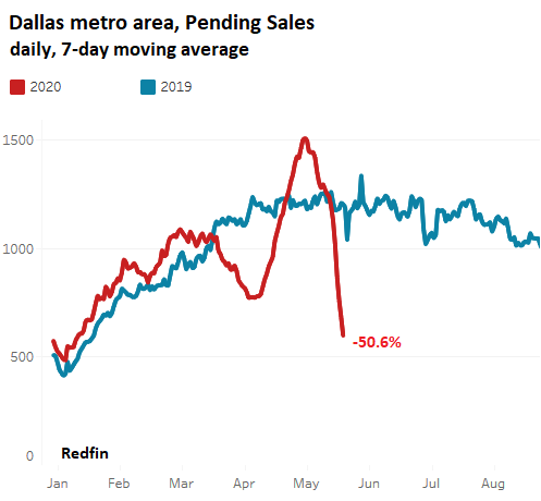
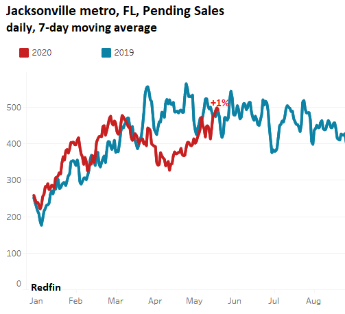
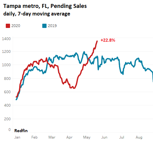
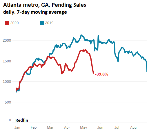
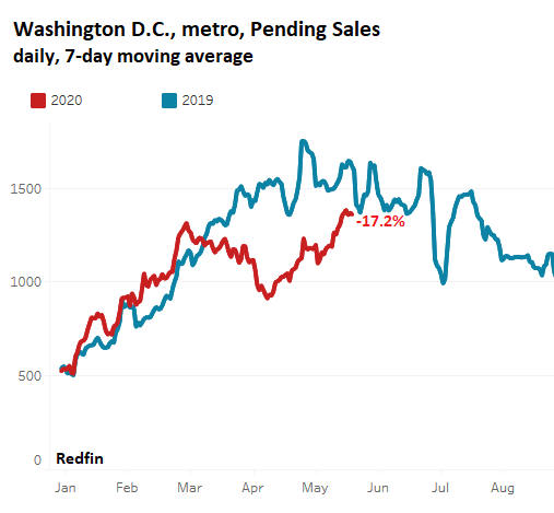
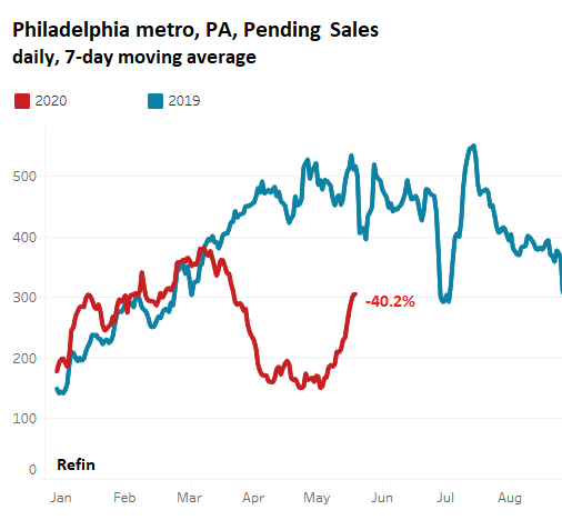
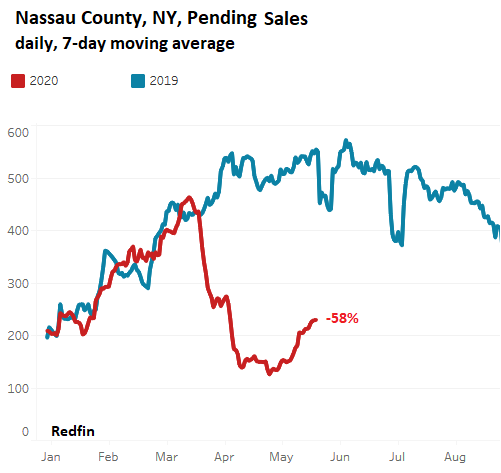
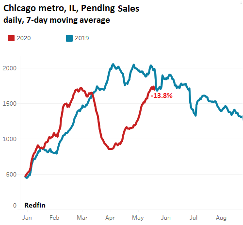
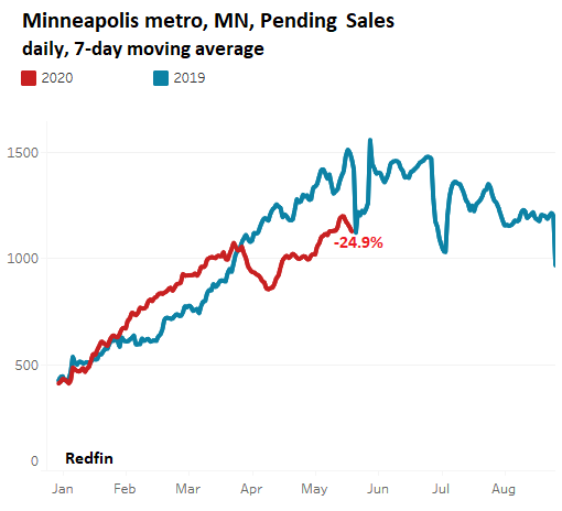
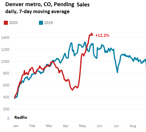
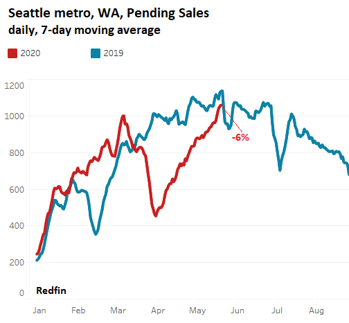
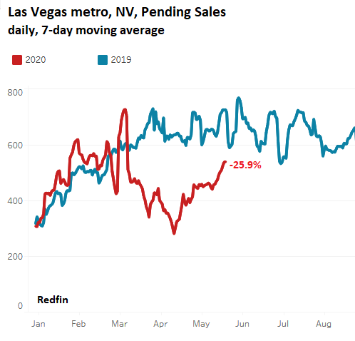
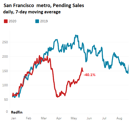
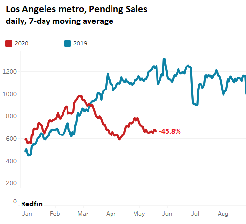
So here are pending sales – with contracts reported as signed in May through May 24th, for 15 big metro areas in the US, computed daily and shown as a 7-day moving average. The data is compiled by real-estate brokerage Redfin, from local multiple listing service (MLS) and Redfin’s own data, and was released at the end of the week. The charts are also from Redfin. However, the data is not available for every major city. The percentage in red indicates the change of the 7-day moving average through May 24 this year compared to the same period last year.
And let me assure you that real estate is local, that “nothing goes to heck in a straight line,” as it says on our WOLF STREET beer mugs, and that sales are headed in astonishingly different directions depending on the local market, from red-hot to ice-cold, with whiplash effect, sometimes in the same state as in Texas.
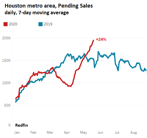
WTF?!? Did pent-up demand from people who’d gotten stir-crazy suddenly collide with the oil bust? Will Houston show a similar phenomenon in a week or two? A mystery for now.
I couldn’t find Miami data in the Redfin data base, so Tampa will do.
I couldn’t pull up the pending sales data for New York City. So here is Nassau County, on Long Island:
I couldn’t get the data for Boston, so west we go.
I couldn’t get Redfin data on Nashville, St. Louis, Detroit, and Kansas City. But here is Minneapolis.
So this was the grand tour of the pending home-sales roller-coaster during the pandemic, with whiplash and all.
