(Hal Turner) In utterly shocking news, quietly revealed by the Federal Reserve Bank at 4:00 PM Friday (While everyone was distracted by Biden’s Vax Mandates, the Afghanistan Debacle, and the then-approaching 9-11 anniversary) the Bank announced a 41% cut in U.S. GDP forecast for the Third quarter 2021.
This is probably the last chart thatMario Draghiwants to see.
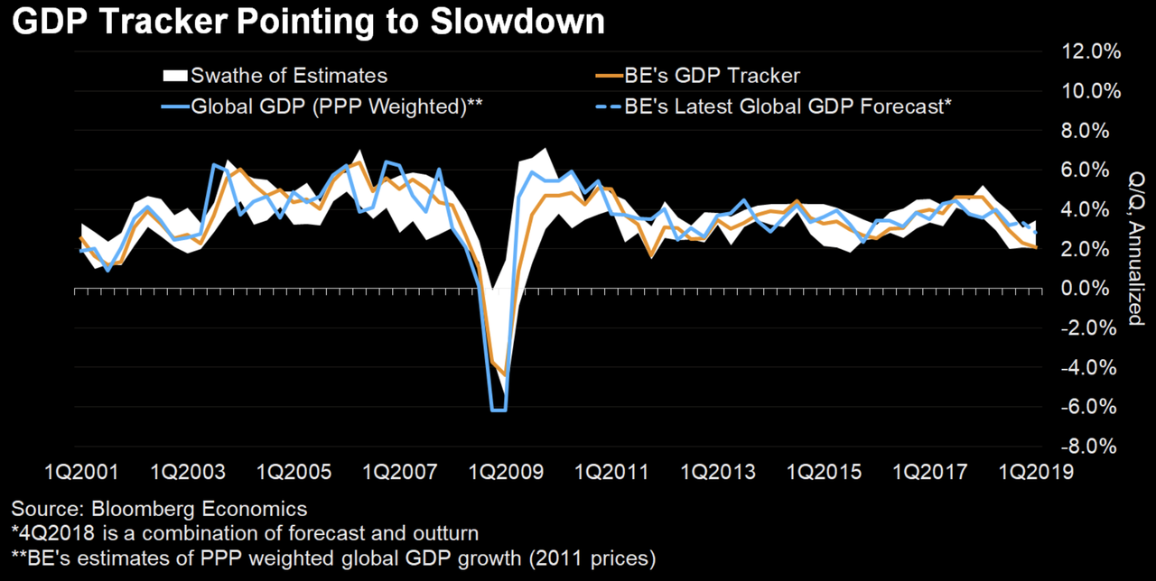
Bloombergeconomics’ global GDP tracker has been downgraded to its slowest pace since the financial crisis, with world economic growth slumping to 2.1% on a quarterly basis. That’s down from 4% in the middle of last year.
And while there’s a chance that a US-China trade deal, the Fed’s “pause”, and a fading of the pressures plaguing Europe might stave off a global recession, Bloomberg economists Dan Hanson and Tom Orlik said the risks appear to be tilted toward the downside. “The risk is that the downward momentum will be self-sustaining.”
“The cyclical upswing that took hold of the global economy in mid-2017 was never going to last. Even so, the extent of the slowdown since late last year has surprised many economists, including us.”
To be sure, the economists aren’t the only ones lowering their outlook on global growth. Last week,the OECD joined the IMF in slashing its 2019 growth forecast, cutting its projection for aggregate global growth to just 1%, just over half of its previous outlook of 1.8%.
While Draghi’s gloomy outlook and decision to push back the timeline for ECB rate cuts last week sent a shock through markets, some ECB officials are apparently still desperately trying to reassure the world that everything is going to be just fine (despite a dearth of economic data implying the opposite).
Executive Board member Benoit Coeure said in an interview with Italian newspaper Corriere della Sera published Monday that “we are still seeing robust economic growth, though it’s less strong than before.”
“It will take longer for inflation (moar money printing) to reach our objective, but it will get there. We are reacting to the developments we have seen so far.”
And although Jerome Powell said during an interview with 60 minutes last night that the US economy is “in a good place”, a raft of economic data, including Friday’s shockingly disappointing jobs report, would suggest otherwise.
This morning the GDP for 2Q was released and it “showed” that the economy has reached a $20 trillion annual run-rate in the United States.
Tout TV was up saying this was (of course) a first (actually it wasn’t; last quarter we had breached it too) and a large increase over the last 10 years.
Well, of course it was a large increase.
There’s only one problem: Exactly zero of it was actual economic expansion.
Yes, I said zero. In fact the economy has contracted over the last 10 years.
What, you say? That’s impossible — look at the numbers!
I did look at the numbers and you did not.
Remember that GDP is C + G + I + (net) Ex
In other words, Consumption + Government Spend + Investment + net Exports (Exports – Imports) = GDP. That’s first-semester economics.
All unbacked borrowing by government is, of course, part of “G”, and once that’s in the economy it never leaves — unless of course government debt goes down (which it hasn’t even during Clinton’s alleged “surplus”, because that “surplus” never actually existed.)
It therefore circulates forevermore in every future quarter, but by emitting that debt you devalue all existing dollars! This means that mathematically GDP “in dollars” will mathematically increase by exactly that amount but that says nothing about whether the actual quantity of goods and services increased.
If you have a certain amount of goods and services produced and double the amount of circulating “moneyness” in the economy then the price level on average doubles, since by definition all goods and services consumed were purchased with something — and that something in the US is denominated in dollars. In other words you will report that “GDP” has “doubled” even though the amount of goods and services produced has not expanded at all.
So here’s the ugly — Here is US Government debt, to the penny, as of 7/25/2008:
07/25/2008
9,540,689,536,562.79
That is, $9.541 trillion dollars.
Here it is on 7/25/2018:
07/25/2018
21,265,465,085,278.12
$21.265 trillion dollars, or $11.72 trillion more.
The current annual run-rate of the economy is $20.402 trillion. In 2008, Quarter 2, it was $14.805 trillion, or an actual increase of $5.60 trillion per year from then to today — in nominal, that is, “dollar-denominated” terms.
Federal government debt added alone was more than double the net increase in nominal GDP over that same period.
In other words the facts are that the economy has actually contracted, not expanded. That’s why the common American is finding food more expensive, fuel more expensive, health care and housing more expensive, cars are more expensive etc etc etc when one looks at the number of hours of effort required to pay for each of such things, that is, in an actual “SI” (or invariant) unit.
The so-called “expansion” since the crash has all been sleight-of-hand — and continues to this day. Nor is this new; it was in fact going on for a good long time (decades) prior to 2008 as well.
Goebbels had nothing on our so-called “modern media”, say much less our current President and the only reason they get away with this crap is that you can’t make change for a $20 without using a computer.
***
Don’t believe the hype.
Work on building skills and learning how to produce food.
For all the rhetoric about above-trend US growth,one month ago UBS shattered the narrative of surging GDPby showing just one chart, which revealed that excluding contributions from energy investment, which are about to hit a brick wall now that the price of oil has peaked and is reverting lower once again, US growth for the past 2 years has been slowing.
On the other hand, things get even more complicated thanks to a chart released yesterday by UBS’ global chief economist Paul Donovan who makes a point we have repeatedly underscored over the past decade, namely that economic data is largely worthless, and any instant snapshot reveals more about the political and “goal seeking” climate of the agency releasing the “data” than about the underlying economy itself.
As Donovan shows, here are the no less than 6 answers one gets to the question of “how fast was the US growing at the start of 2015?.”
By way of context, recall that this was the quarter when the US was blanketed by deep snow, and when every “expert” was rushing to convince those who bothered to listen that the economy would suffer a sharp slowdown as a result of the weather and nothing but the weather (and yes, that included UBS). And when the number was first reported, that was indeed the case: with Q1 2015 GDP reportedly growing only 0.2%. The problem is that within just over a year, that 0.2% initial GDP print turned to -0.7%, before subsequently surging to 2% and ultimately 3.2%!
Here is the sarcastic take of UBS’ own chief economist on this GDP travesty, which is even more sarcastic – and ironic – considering his entire job is to predict the exact number associated with said travesty:
Economic data is not very precise. Economists are trying to hit a target that is moving rapidly. Economic data is being revised more often, and the revisions are larger than in the past. The following chart shows annualized US GDP growth in the first quarter of 2015.
Growth was initially reported very weak, below consensus and barely moving. Then the data was revised to show the US economy was shrinking – and shrinking a lot (the number was –0.7% annualized). Then it was revised to show the economy was shrinking a bit. Then it was revised to show the economy was growing, but a long way below trend growth.
The growth number was then revised to be basically in line with trend growth. Now, US growth at the start of 2015 is thought to be 3.2%.
So which number in the range of –0.7% to 3.2% is the economist supposed to be forecasting? An economist predicting 3.2% growth when the data was first released would have been ridiculed. According to the latest information we have, that economist would have been right.
In other words, that terrible weather which at the time was used to justify why the economy ground to a halt – when in reality it was all a function of China’s credit impulse crashing – would eventually serve as a the catalyst to grow the economy at a pace that has been recorded on just a handful of occasions in the past decade.
No wonder then economists – especially those who work at the Fed but all of them really – their predictions and their analyses have become the butt of all jokes; and by implication, no wonder traders and algos no longer respond to economic “data.”
In “Underwater Homeowners Here To Stay” we highlighted a report from Zillow which showed that negative equity has now become a permanent fixture of the US housing market. The report also showed that the percentage of homeowners who are underwater was flat from Q314 to Q414, breaking a string of 10 consecutive quarters of declines. We also recently noted that a completely ridiculous new home sales print that defied all logic notwithstanding, housing data, including starts and existing home sales, has come in below expectations. On a side note, home price appreciation has outpaced wage growth at a rate of 13:1, to which we would add:
Of course, the biggest determinant of home price appreciation over the past 2 years has nothing to do with US consumers, or household formation, as confirmed by the collapse in first-time home buyers or the unprecedented depression in new mortgage origination, and everything to do with what we first suggested is one of the main drivers of the US housing bubble – foreigners parking their illegally procured cash in the US and evading taxes, now that US housing, with the NAR’s anti-money laundering exemption blessing, is the new normal’s Swiss Bank Account. That and flipping homes from one “all-cash” buyer to another “all-cash” buyer in hopes of a quick capital appreciation and the constant presence of the proverbial dumb money.
Against this backdrop, Deutsche Bank is out predicting that a sluggish US housing market is likely to impact the supply of MBS going forward. As DB notes, housing isn’t the GDP contributor it once was and not by a long shot. Not only that, but when it comes to recoveries, the housing market’s GDP contribution was 7 times below its post WW2 average in year one and has fared even worse since. Here’s DB with more:
The contribution of housing to US GDP continues to run at some of the lowest levels since the end of World War II. New construction of single- and multi-family homes, renovations, broker fees and the like still only make up a bit more than 3% of current GDP, well below the post-war average of 4.7%. Not only has the level of lift from housing come in low, but it has bounced out of the last official recession slowly, too. Housing on average has contributed a half a percentage point to GDP a year after the end of every post-war US recession. This time around, housing added only 7 bp. And the contribution of housing in the second and third years after the recent recession also has fallen well below post-war averages.And while “insufficient supply” (not enough homes) was cited as a possible contributor to the existing home sales miss, DB notes that at least as of today, there appears to still be a “supply hangover” (although it’s waning):
US home ownership started the decade at 66.9%, peaked in 2004 at 69.2% and ended at 66.5%. It has since dropped to 64.0%. The exodus of owners initially threatened to leave a lot of extra houses behind and reduce the need to build new ones. But investors have come in to pick up the keys, and many houses have found a new home in the market for single-family rentals. This has helped reduce the supply of distressed homes, although it’s still higher than the levels that prevailed in the early 1990s when homeownership last ranged around 64% . The supply hangover isn’t done but should be in the next two or three years.
And demand isn’t looking so hot either:
Demand has likely played a part in slow housing, too, starting with owners that bought their homes in the last decade. Thanks to a 38% drop in home prices nationally from 2006 to 2012, according to Case-Shiller, a lot of those owners walked out the front door without any equity and without the ability to reenter the market as buyers. This has almost certainly contributed to the drop in rental unit vacancies from 10.6% in mid-2009 to 7.0% today. As for potential new owners, Americans, even before the crisis, started moving into their own place at a much slower pace than the long-term average of 1.2 million new households a year, that is, until recently. Demand from former and potential new owners has been soft.
Even in the best case scenario is which supply falls and demand rises, banks’ reluctance to lend could end up hobbling the market for the foreseeable future.
Although the market seems to be clearing out the lingering housing supply and the economy and the labor market look likely to repair demand, the availability of credit could prove to be the lasting constraint. Today’s lending standards reflect limits designed to keep the last decade’s boom and bust from happening again. Borrowers today without the ability to repay will not get a loan. But it looks like some borrowers with the ability to repay—but with low FICO scores or with needs that keep them outside the agency or prime jumbo markets—will also not get a loan. The market is reducing risk today to avoid risk tomorrow. But it also is likely reducing housing growth today to avoid a downturn tomorrow.
And here’s further confirmation of this from BofAML:
So there is your housing recovery in a nutshell: supply hangover, lackluster demand, and reluctant lenders all coalescing in a housing market whose contribution to US economic growth is virtually nonexistent.
And if you’re looking for the next shoe to drop, here’s a hint:
The chart below showing the annual increase, or rather, decrease in US factory orders which have now declined for 6 months in a row (so no one can’t blame either the west coast port strike or the weather) pretty much speaks for itself, and also which way the US “recovery” (whose GDP is about to crash to the 1.2% where the Atlanta Fed is modeling it, or even lower is headed.
As the St Louis Fed so kindly reminds us, the two previous times US manufacturing orders declined at this rate on an unadjusted (or adjusted) basis, the US economy was already in a recession.
And now, time for consensus to be shocked once again when the Fed yanks the rug from under the feet of the rite-hike-istas.
The Chicago Business Barometer plunged 13.6 points to 45.8 in February, the lowest level since July 2009 and the first time in contraction since April 2013. The sharp fall in business activity in February came as Production, New Orders, Order Backlogs and Employment all suffered double digit losses, leaving them below the 50 level which separates contraction from expansion.
New Orders suffered the largest monthly decline on record, leaving them at the lowest since June 2009. Lower order intake and output levels led to a double digit decline in Employment which last month increased markedly to a 14-month high.
Disinflationary pressures were still in evidence in February, although the slight bounce back in energy costs pushed Prices Paid to the highest since December – although still below the breakeven 50 level. Some purchasers cited weakness in some metals prices including copper and brass, but others said suppliers were slow to pass along lower prices to customers.
Commenting on the Chicago Report, Philip Uglow, Chief Economist of MNI Indicators said, “It’s difficult to reconcile the very sharp drop in the Barometer with the recent firm tone of the survey. There’s some evidence to point to special factors such as the port strike and the weather, although we’ll need to see the March data to get a better picture of underlying growth.“
Blame it on the Ports
Everyone was quick to blame this on the ports and bad weather.
But the LA port issue has been festering for months. Weren’t economists aware of the ports? Of bad weather?