
(David Haggith) Having written that Powell’s Peril Lies in the Languishing Labor Market and that we are Fed up and Under-Fed All at the Same Time because Everyone Sings the “Strong Labor Market” Tune in Unison … and They’re All DEAD Wrong, I finally get some VINDICATION! Major vindication!
Tag Archives: jobs
“A V-Shaped Recovery Will Not Be Possible”: Today’s Job Losses Reflect A 40% GDP Crash
Now that the worst jobless print and unemployment rate in US history are in the record books, the next questions are i) what does this mean for the US economy and ii) how long before things revert back to normal.
Addressing the second question first, Morgan Stanley earlier this week laid out three scenarios, a bull, base and bear case. What is notable is that even the bull case sees a full recovery only in 2021. The base case tacks on another year to the recovery while the bear case sees double-digit unemployment into 2022 and onward.
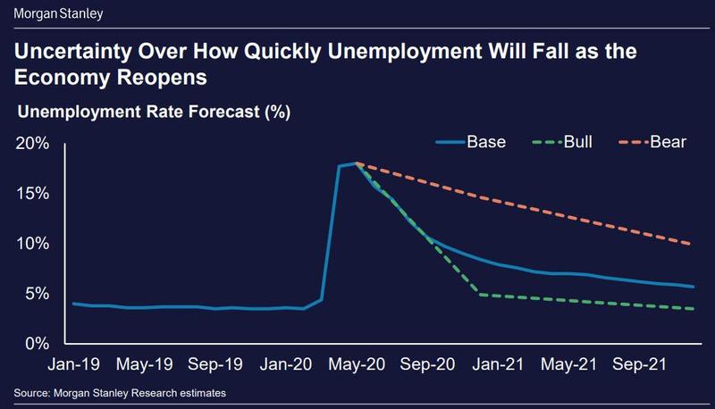
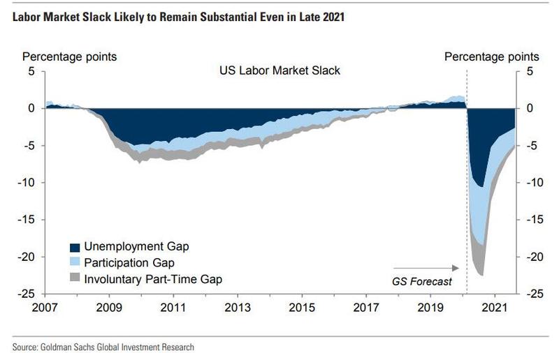
Goldman agrees with Morgan Stanley, and even in its optimistic report that the US has now moved past the bottom (assuming the is no second round of closures in late 2020), the bank expects labor market slack to remain substantial even in late 2021 and entering 2022.
The bottom line here is that contrary to expectations for a quick return to normal, it will take years (if ever) before the unemployment rate recorded in late 2019 is back.
As for the first question, namely what is the economic impact from today’s catastrophic jobs report, here is the answer from Bloomberg’s Economic team:
“The extent of job losses is consistent with Bloomberg Economics’ modeling of a near 40% contraction in real GDP for the quarter. While layoffs were concentrated in sectors such as restaurants, hospitality and leisure, losses occurred in nearly all subcategories.”
As Bloomberg concludes:
“the breadth of job losses is a jarring signal of the massive challenge of restarting vast swaths of the economy – not just a few sectors – and it therefore serves as a stark indication that a ‘V-shaped’ recovery will not be possible.”
Meanwhile, stocks are now higher than they were a year ago, when the unemployment rate was about 3.5%. Thanks Fed.
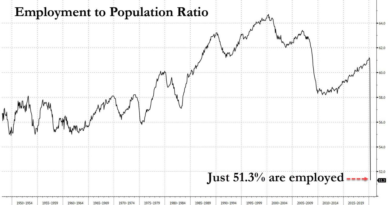
A Tragic Record: For The First Time Ever, More Than Half Of The US Population Is Not Working
Today’s jobs report was, as expected and as previously discussed, absolutely horrific, although as Bank of America points out there was one silver lining which Larry Kudlow quickly latched on to: with 72% of jobs lost being reflected as temporary layoffs, workers should be able to be more seamlessly rehired as the economy reopens. However, the longer this pandemic goes on, the more likely that what was temporary becomes permanent, and as ZeroHedge pointed out in a previous post, even baseline cases see unemployment not returning back to normal until 2022 or later.
Offsetting this “good news”, however, there was one especially scary aspect of today’s jobs report that has not gotten enough publicity, namely that as BofA writes, the employment to population ratio plunged to a record low, with only 51.3% of the population working. Inversely, this means that in April, 49% of the US population was not working.
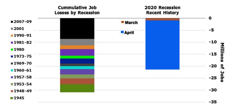
Worst Jobs Report In History: 20.5 Million Jobs Lost As Unemployment Rate Hits Record 14.7%
It gets worse.
As a reminder, the BLS said that if the workers who were recorded as employed but absent from work due to “other reasons” had been classified as unemployed on temporary layoff, the overall unemployment rate would have been almost 5 percentage points higher than reported, meaning that the true unemployment rate as of this moment is 20%
White House economic adviser Kevin Hassett laid the groundwork for shocking the US population for this devastating reality, when he said in a CNN interview that next month’s jobs report “should be around 20%,” adding that the U-6, or the underemployment rate, will probably hit around 25% in the next report.
This means that the employment-to-population ratio is also under counted by about 4-5%, and that as of this moment (we will get the May jobs data in 1 month), the employment to population ratio is below 50%, indicating that for the first time in history, more than half of the US population is unemployed!
Which is great news for stocks: think of all the people who have nothing better to do than buy the fucking dip all day with all that helicopter money the Fed will be showering on them for the coming years.
The Great Transformation: Robots Will Displace 20 Million Jobs By 2030

A new report by Oxford Economics says accelerating technological advances in automation, engineering, energy storage, artificial intelligence, and machine learning have the potential to reshape the world in the 2020s through 2030. The collision of these forces could trigger economic disruption far greater than what was seen in the early 20th century.
Across the world, a new wave of investment in automation could displace 20 million manufacturing jobs by 2030. This coming period of change should be called the great transformation period where job losses due to automation will be on par to the automation of agriculture revolution ( the transition of farm workers into the industrial sector) from 1900 to 1940.
Robots have so far increased three-fold since the Dot Com bust. Momentum in trends suggests the global stock of robots will multiply even quicker through the 2020s, reaching as many as 20 million by 2030, with 14 million in China alone. The collision of automation in the economy will lead to more volatility and economic swings.
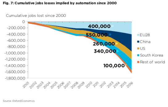
The adoption of new automation technologies can significantly boost income inequality and, by extension, wealth inequality. Many countries, including the US, are entering the 2020’s with extreme inequalities, and automation will likely accelerate that trend. Oxford Economics estimates that 20 million manufacturing jobs across the world will be displaced by robots by 2030.

By 2030, most of the automation disruption in major manufacturing countries will be centered in China, the EU, and the US:
- China: over 11 million
- European Union: almost 2 million
- United States: nearly 1.7 million
- South Korea: nearly 800,000
- The rest of the world: 3 million
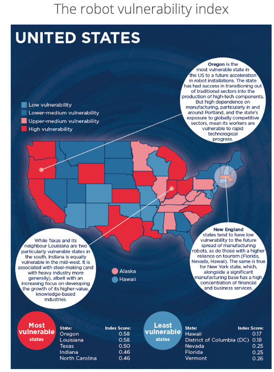
Oxford Economics developed the Robot Vulnerability Index – where specific regions across the US are at the highest risk of labor disruption thanks to automation.
The crosscurrents of these macroeconomic force could dramatically reshape economies around the world. Nevertheless, displacing blue-collar manufacturing jobs with robots will continue to drive income/wealth inequality to such extreme levels that governments will be forced to become more interventionist, using higher taxes, regulation, and policy to control economic imbalances.
Politics Of The Employment Report
Today’s non-farm payrolls miss, 134k total jobs created in September, sealed the deal on the job creation political debate before the November midterms. That is all things being equal — during President Trump’s first 20 employment reports versus President Obama’s last 20 — the Trump economy created 347k fewer total non-farm payroll jobs, and 137k fewer private sector jobs, than President Obama’s economy.
The differential will move even more against President Trump when October non-farm payrolls are reported, the Friday before the election, as the May 2015 326k jobs comp will be a bar too high to conquer.
These are the facts, spin them as you wish.
On the eve of the midterm elections it is likely that the Democrats will be able to argue that President Obama’s economy created 500k more jobs than President Trump’s economy over a similar period. Reality clashes with virtual reality and bombastic rhetoric.
Perspective
However, all things are never equal. The Trump economy is running up against labor constraints with shortages breaking out almost everywhere, which is reflected in today’s 3.7 percent unemployment rate print, a 49-year low. It’s difficult to create the marginal job on this side of the inelastic labor supply curve.
Data should always be placed in the proper context. But, hey, we are talking politics here, and, “politics ain’t beanbag,” folks.
Other Notables
- The shrinking labor supply is illustrated in the inflation differentials during the two periods – 4.14 percent under Trump, and 2.12 percent during Obama’s last 20 months in office.
- Trump’s nominal Average Hourly Earnings are running about 70 bps higher than Obama
- Real Average Hourly Earnings under Trump is about 1.3 percent lower than during President Obama’s last 20 employment reports
- Real GDP growth under Trump is almost double President Obama’s last six quarters in office, but not reflected in the overall labor market, which reflects the economy continues to reward capital disproportionate to labor
- Manufacturing jobs have recovered smartly during President Trump first 20 months, much of it due to the increase in oil prices, especially in the mining sector
- Job creation in the government sector, which, on average, generates higher income paying jobs than the private sector, is much lower under President Trump


Where The Jobs Were In June: Who’s Hiring And Who Isn’t
As noted earlier, September was a hurricane-affected month for payrolls, resulting in lower than expected jobs across several categories, among which Leisure and Hospitality jobs were the hardest hit.

However, a deeper dive reveals that other industries were also severely impacted, with the 2nd worst September in contraction in Retail (-20K), Telecom (-3K), Education (-12K), Child Care (-4K) and Food Services (-23K).
This, according to Southbay Research, was remarkable because while last year’s layoffs surged 100K above trend due to 2 major Hurricanes that displaced millions and destroyed 10s of thousands of homes, with jobless claims across Texas, Florida and Puerto Rico soaring by 100K+, this year, one hurricane came but was very mild and had minimal impact, with Initial Jobless Claims rose a combined 12K. Yet somehow, “the impact was the same.”
Here’s one example: Food Services. As Southbay notes, somehow a mild storm led to layoffs at a scale only seen last year when 2 major Hurricanes shut down Puerto Rico and Florida and pummeled Texas.

One note here is that if one were to revise last month’s data to incorporate the “missing” jobs, the impact on hourly earnings would be adverse as these are mostly lower paying jobs, and while the result would have been higher jobs, it would have also pushed down on hourly earnings.
Odd BLS estimates of layoffs aside, we know the following:
- Employment in professional and business services increased by 54,000.
- Health care employment rose by 26,000 as hospitals added 12,000 jobs, and employment in ambulatory health care services continued to trend up (+10,000).
- Employment in transportation and warehousing rose by 24,000. Job gains occurred in warehousing and storage (+8,000) and in couriers and messengers (+5,000).
- Construction employment continued to trend up in September (+23,000).
- Employment in manufacturing continued to trend up in September (+18,000)
- Employment in mining, employment in support activities for mining rose by 6,000
And visually:

Looking over the past year, the following charts from Bloomberg show the industries with the highest and lowest rates of employment growth for the prior year. The latest month’s figures are highlighted.

One final observation from Southbay Research, who notes that overtime pay dropped as staffing increases.
Overtime is a temporary solution to strong demand. While a drop in overtime can signal a fall in demand, it can signal that employers no longer think the strong demand is temporary.
Whatever the reason, after 1+ years of above-trend overtime, employers have turned to hiring. Because it’s also cheaper than paying double rates for overtime. This, to Soutbay, “is another metric supporting continued hiring growth.”

The College Collapse

“..What this tells us is the elite are beginning to set fire to the bridges over the river that separates them from us. The positions in the Cloud will require passing through one of the monasteries to be properly vetted. In the future, the Dirt People will have to sort out their status system within their favelas…”
Back when National Review first allowed comments on their posts, they would post all sorts of things in their group blog. Readers would respond to all of it. For example, when they were looking for a receptionist, they posted the job on the blog. Hilariously, one of the requirements was a four-year degree. Why anyone with a college degree would take a receptionist job was a mystery, but an even bigger mystery was why National Review would require it. The comments on it were the best things posted that week.
Of course, Rich Lowry was not really thinking about the requirements of the job when he posted it. What he wanted was someone from his world, the world where everyone goes off to college and sends their kids off to college. In other words, he was signalling to potential applicants that he did not want Rosie from the neighborhood, who likes to file her nails while on the phone. Instead, he wanted a young white girl fresh out of college, who just needed a job while she sorted out what she was going to do with her life.
That is, in many ways, what a college degree has become since the 60’s. It tells potential employers things about yourself that they could never ask and that would never show up on the CV. For example, if you went to a private college, it means you most likely were raised in an upper middle-class family. If you went to the satellite campus of the state university, it probably means you came from the lower ranks and you were not a great student. These are the sort of subtle clues that are reflected in the education section.
Of course, attending an elite university is the big flashing neon sign on a person’s resume, which is why entrance is super-competitive. It’s also why it is not difficult to graduate from one of these colleges. The graduation rates at these colleges are near 100%, even for athletes. Compare that to Ranger School, where 60% fail the first time. Yet, if you have the former on your CV, it counts for more than if you have the latter. The people hiring for elite positions care much more about what the former says about the applicant.
This is why a few years ago the elites started to panic over the influx of foreign students into elite colleges. The competition for these slots was already tough. Having to compete with the children of foreign ruling classes would make the process even more difficult for the children of Cloud People. Of course, this is why Harvard, and most likely the other elite colleges, discriminate against Asians. The elite is for whites and Jews, with a sprinkling of diversity to spice it up to allow the elite to pretend they like diversity.
This “problem” with the elite colleges has been an excuse for the ConservoCons to shriek “hypocrite” at their Progressive masters, but it is actually a good thing that the people in charge are fine with racial discrimination. At the minimum, it suggests they still have the will to survive. It also reminds us that they are not bound by their own rules when defending their privileges. No ruling class in human history has peacefully agreed to step aside based on the logic of their own rules. They always have to be removed by force.
At the other end of the spectrum, colleges that serve the hoi polloi have been struggling with a different set of problems. A diploma from State U is about practical things like getting a job and bargaining for a salary. In fact, it really only matters for the first decade after graduation. After that, the work history is what counts. The great bust-out that is the American public college system has reached a terminus and enrollments are now starting to drop, as people figure out the return is not always worth the investment.
As a result, the public universities in America are slowly beginning to change. One remedy has been to import foreign students, who will pay full rate. This actually started with small private colleges like Boston University in the 1980’s. They figured out that Japanese kids would come to Boston, pay tuition in cash, as long as they were not required to study too hard. For state colleges, there is the added benefit of being able to charge full rate, rather than the discounted rate for in-state students. That and it counts for diversity points.
Of course, like every business fighting a revenue drop, cost cutting is on the table. In America, much of college is just an extension of high school. Look at the requirements of college fifty years ago and compare them to now. Then there are the frivolous things like gender studies or communication arts. Pretty much everything in the core curriculum of a modern college should be tackled in high school. The rest should be discarded. That’s why we see colleges dropping large chunks of their current offerings.
There is something else going on that speaks to the larger issues looming over the North American Economic Zone. Members of the High Moral Council are starting to drop the college requirement for new hires. What this tells us is the elite are beginning to set fire to the bridges over the river that separates them from us. The positions in the Cloud will require passing through one of the monasteries to be properly vetted. In the future, the Dirt People will have to sort out their status system within their favelas.
It also opens the door to further polluting the standards that reflect biological reality. By dropping the college requirement, the companies are free to hire the black over the white, the female over the male. After all, without anything close to an objective standard, the latest moral fads handed down from on high are the default filter. It also makes the diversity tax explicit. Companies will be expected to hit their vibrancy quotas, because they will not have the excuse that they cannot find qualified non-white candidates.
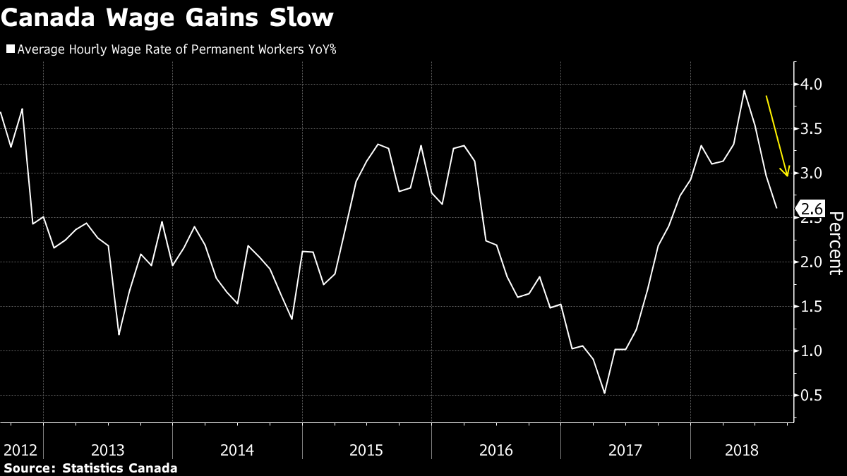
Canadian Economy Lost 51,600 Jobs In August – Largest Drop In Decade
Canada’s economy unexpectedly lost 51,600 jobs, with wage gains slowing and Ontario recording its biggest employment drop in nearly a decade, removing any urgency for the central bank to accelerate rate hikes.
The nation’s largest province lost 80,100 jobs in August, all part-time, the biggest decline for Ontario since 2009. Nationally, the economy lost 92,000 part-time workers, though a 40,400 gain in full-time employment is one sign the labour market is firmer than the headline number suggests.
“The wacky world of Canadian jobs data stayed that way in August, but there was at least one positive amidst a generally downbeat report that came on the heels of an upbeat July. That positive was in a solid 40,000 rise in full time work, but that was swamped by a nose-dive in part time jobs,” Avery Shenfeld, managing director and chief economist with CIBC Capital Markets, wrote in a note to clients.
The data released Friday by Statistics Canada in Ottawa reversed strong employment gains made earlier this summer, including sharp increases in Ontario. But the overall picture is one of a labour market gearing down markedly from last year and an economy not at risk of overheating. That reinforces expectations the Bank of Canada will take a cautious approach to increasing borrowing costs.

The jobs numbers are “consistent with a gradual rate hike path and really not a whole lot of urgency,” said Robert Kavcic, a senior economist at BMO Capital Markets.
The Canadian dollar slipped after the jobs report, down as much as 0.3 per cent to $1.3182 per U.S. dollar. The currency rose as much as 0.4 per cent Thursday after Bank of Canada Senior Deputy Governor Carolyn Wilkins said the central bank’s top officials debated this week whether to accelerate the pace of potential interest rate hikes, before finally choosing to stick to their current “gradual” path.
The Bank of Canada has raised interest rates four times since mid-2017 to keep inflation from moving permanently beyond its 2 per cent target, and indicated it will need to make additional hikes to keep price gains from accelerating because the economy is roughly at capacity.
So far in 2018, the economy has shed 14,600 jobs, but the number masks a 97,300 gain in full-time jobs. Part-time employment is down by 111,900 this year.
The net loss in August — which was the second largest monthly decline since the last recession — drove the unemployment rate to 6 per cent, from 5.8 per cent a month earlier, while wage gains decelerated to their slowest this year. However, the jobless rate still remains near four-decade lows.
Economists had expected a gain of 5,000 jobs and an unemployment rate of 5.9 per cent, according to the median estimate in a Bloomberg survey.
Other Highlights
-Wage gains for all workers slowed in August, with average hourly pay up 2.9 per cent from a year ago. That’s the slowest pace since December.
-Wage gains for permanent employees were down to 2.6 per cent, the slowest since October
-Actual hours worked were up 1.6 per cent from a year ago, after an increase of 1.3 per cent in July, reflecting the increase in full-time workers
-By industry, the decline was broad-based and included a loss of 16,400 jobs in construction and 22,100 in the professional services sector.
Americans Show “Enormous Increase In Support” Of Universal Basic Income
As automation and AI destroy millions of middle-income jobs, permanently forcing (primarily male) workers from the workforce, Americans are beginning to reconsider their attitudes toward a radical policy tool that’s popular among some segments of the left: Universal Basic Income.
According to CNBC, a recent poll conducted by Northeastern University and Gallup found that 48% of Americans support the measure. In an association that’s hardly a coincidence, the poll also showed that three-quarters of Americans believe machines will take away more jobs than they’ll generate…

Unsurprisingly 65% of Democrats want to see a universal basic income and 54% of people between the ages of 18 and 35 do. In comparison, just 28% of Republicans support UBI.
While proposals for universal basic income programs vary, the most common one is a system in which the federal government sends out regular checks to everyone, regardless of their earnings or employment. That system is being tested in Canada and Finland, as well as Stockton, California, which recently emerged from bankruptcy but remains mired in poverty.
Support for UBI and wariness about automation/AI have become closely linked in the public consciousness. The movement has even inspired America’s first “anti-automation” presidential candidate: New York businessman Andrew Yang is launching a “longer-than-long-shot bid” for the 2020 Democratic nomination, on a platform of adopting a “freedom dividend” (a fancy term for UBI), to help offset the impact of automation.
Advocates say all of the UBI-focused experiments being conducted are an opportunity to show that the policy could boost both productivity, as well as individual happiness and overall wellbeing.
“The claim is often made that if you give people a basic income, they’ll become lazy and stop doing work,” said Guy Standing, co-founder of the Basic Income Earth Network. “It’s an insult to the human condition. Basic incomes tend to increase people’s work rather than reduce it.”
Political philosopher and economist Karl Widerquist remembers a poll from 10 years ago that showed just 12 percent of Americans approved of a universal basic income.
“It’s an enormous increase in support,” Widerquist said.
“We don’t need to threaten people with homelessness and poverty to get them to work,” he added.
“It’s capitalism where income doesn’t start at zero.”
Of course, the odds of UBI actually being enacted in the US are highly unlikely.

Robert Greenstein, president of the Center on Budget and Policy Priorities, estimates that a program providing everyone with $10,000 annually could cost more than $3 trillion a year, a bill that is more likely to increase poverty than reduce it.
“This single-year figure equals more than three-fourths of the entire yearly federal budget – and double the entire budget outside Social Security, Medicare, defense, and interest payments,” Greenstein wrote in a CBPP commentary last year.
Still, a recent McKinsey study found that automation could eliminate up to 800 million jobs by 2030…
…If such a dire outlook comes to pass, the US – and practically every government – will need to devise a plan for mitigating the devastating impact this will have on employment.

So – in ten years, eight of which were ruled over by President Obama – the proportion of Americans who want more free shit for doing nothing has quadrupled (from 12% to 48%)… now that is ‘conditioning’!!
Small Town Suburbia Faces Dire Financial Crisis As Companies, Millennials Flee To Big Cities

College graduates and other young Americans are increasingly clustering in urban centers like New York City, Chicago and Boston. And now, American companies are starting to follow them. Companies looking to appeal to, and be near, young professionals versed in the world of e-commerce, software analytics, digital engineering, marketing and finance are flocking to cities. But in many cases, they’re leaving their former suburban homes to face significant financial difficulties, according to the Washington Post.
Earlier this summer, health-insurer Aetna said it would move its executives, plus most of technology-focused employees to New York City from Hartford, Conn., the city where the company was founded, and where it prospered for more than 150 years. GE said last year it would leave its Fairfield, Conn., campus for a new global headquarters in Boston. Marriott International is moving from an emptying Maryland office park into the center of Bethesda.

Meanwhile, Caterpillar is moving many of its executives and non-manufacturing employees to Deerfield, Ill. from Peoria, Ill., the manufacturing hub that CAT has long called home. And McDonald’s is leaving its longtime home in Oak Brook, Ill. for a new corporate campus in Chicago.
“Visitors to the McDonald’s wooded corporate campus enter on a driveway named for the late chief executive Ray Kroc, then turn onto Ronald Lane before reaching Hamburger University, where more than 80,000 people have been trained as fast-food managers.
Surrounded by quiet neighborhoods and easy highway connections, this 86-acre suburban compound adorned with walking paths and duck ponds was for four decades considered the ideal place to attract top executives as the company rose to global dominance.
Now its leafy environs are considered a liability. Locked in a battle with companies of all stripes to woo top tech workers and young professionals, McDonald’s executives announced last year that they were putting the property up for sale and moving to the West Loop of Chicago where “L” trains arrive every few minutes and construction cranes dot the skyline.”
The migration to urban centers, according to WaPo, threatens the prosperity outlying suburbs have long enjoyed, bringing a dose of pain felt by rural communities and exacerbating stark gaps in earnings and wealth that Donald Trump capitalized on in winning the presidency.
Many of these itinerant companies aren’t really moving – or at least not entirely. Some, like Caterpillar, are only moving executives, along with workers involved in technology and marketing work, while other employees remain behind.
“Machinery giant Caterpillar said this year that it was moving its headquarters from Peoria to Deerfield, which is closer to Chicago. It said it would keep about 12,000 manufacturing, engineering and research jobs in its original home town. But top-paying office jobs — the type that Caterpillar’s higher-ups enjoy — are being lost, and the company is canceling plans for a 3,200-person headquarters aimed at revitalizing Peoria’s downtown.”
Big corporate moves can be seriously disruptive for a cohort of smaller enterprises that feed on their proximity to big companies, from restaurants and janitorial operations to other subcontractors who located nearby. Plus, the cancellation of the new headquarters was a serious blow. Not to mention the rollback in public investment.
“It was really hard. I mean, you know that $800 million headquarters translated into hundreds and hundreds of good construction jobs over a number of years,” Peoria Mayor Jim Ardis (R) said.
For the village of Oak Brook, being the home of McDonald’s has always been a point of pride. Over the year’s the town’s brand has become closely intertwined with the company’s. But as McDonald’s came under pressure to update its offerings for the Internet age, it opened an office in San Francisco and a year later moved additional digital operations to downtown Chicago, strategically near tech incubators as well as digital outposts of companies that included Yelp and eBay. That precipitated the much larger move it is now planning to make.
“The village of Oak Brook and McDonald’s sort of grew up together. So, when the news came, it was a jolt from the blue — we were really not expecting it,” said Gopal G. Lalmalani, a cardiologist who also serves as the village president.
Lalmalani is no stranger to the desire of young professionals to live in cities: His adult daughters, a lawyer and an actress, live in Chicago. When McDonald’s arrived in Oak Brook, in 1971, many Americans were migrating in the opposite direction, away from the city. In the years since, the tiny village’s identity became closely linked with the fast-food chain as McDonald’s forged a brand that spread across postwar suburbia one Happy Meal at a time.
“It was fun to be traveling and tell someone you’re from Oak Brook and have them say, ‘Well, I never heard of that,’ and then tell them, ‘Yes, you have. Look at the back of the ketchup package from McDonald’s,’ ” said former village president Karen Bushy. Her son held his wedding reception at the hotel on campus, sometimes called McLodge.
The village showed its gratitude — there is no property tax — and McDonald’s reciprocated with donations such as $100,000 annually for the Fourth of July fireworks display and with an outsize status for a town of fewer than 8,000 people.”
Robert Gibbs, the former White House press secretary who is now a McDonald’s executive vice president, said the company had decided that it needed to be closer not just to workers who build e-commerce tools but also to the customers who use them.
“The decision is really grounded in getting closer to our customers,” Gibbs said.
Some in Oak Brook have begun to invent conspiracy theories about why McDonald’s is moving, including one theory that the company is trying to shake off its lifetime employees in Oak Brook in favor of hiring cheaper and younger urban workers.
“The site of the new headquarters, being built in place of the studio where Oprah Winfrey’s show was filmed, is in Fulton Market, a bustling neighborhood filled with new apartments and some of the city’s most highly rated new restaurants.
Bushy and others in Oak Brook wondered aloud if part of the reasoning for the relocation was to effectively get rid of the employees who have built lives around commuting to Oak Brook and may not follow the company downtown. Gibbs said that was not the intention.
‘Our assumption is not that some amount [of our staff] will not come. Some may not. In some ways that’s probably some personal decision. I think we’ve got a workforce that’s actually quite excited with the move,’ he said.”
Despite Chicago’s rapidly rising murder rate and one would think its reputation as an indebted, crime-ridden metropolis would repel companies looking for a new location for their headquarters. But crime and violence rarely penetrate Chicago’s tony neighborhoods like the Loop, where most corporate office space is located.
“Chicago’s arrival as a magnet for corporations belies statistics that would normally give corporate movers pause. High homicide rates and concerns about the police department have eroded Emanuel’s popularity locally, but those issues seem confined to other parts of the city as young professionals crowd into the Loop, Chicago’s lively central business district.
Chicago has been ranked the No. 1 city in the United States for corporate investment for the past four years by Site Selection Magazine, a real estate trade publication.
Emanuel said crime is not something executives scouting new offices routinely express concerns about. Rather, he touts data points such as 140,000 — the number of new graduates local colleges produce every year.
“Corporations tell me the number one concern that t: Zerohey have — workforce,” he said.”
Chicago Mayor Rahm Emanuel said the old model, where executives chose locations near where they wanted to live has been upturned by the growing influence of technology in nearly every industry. Years ago, IT operations were an afterthought. Now, people with such expertise are driving top-level corporate decisions, and many of them prefer to live in cities.
“It used to be the IT division was in a back office somewhere,” Emanuel said. “The IT division and software, computer and data mining, et cetera, is now next to the CEO. Otherwise, that company is gone.”
LinkedIn Job Postings Plunge, “by far the Worst Month since January 2009”
Is the job market for professionals unraveling?

The jobs data in the US has recently taken a nasty spill. Last week it was an ugly jobs report from the Bureau of Labor Statistics. It could bounce off next month, and the current data could be revised higher, but we’re not seeing the signs of this sort of hiring momentum.
Instead, we’re confronted with a sharp and ongoing deterioration of a leading indicator of the labor market: temporary jobs. They rise and fall months ahead of the overall number of jobs. The sector peaked in December 2015 at 2.94 million. It shed 21,000 jobs in May, and 63,800 since December. This is also what happened in 2007 and 2000, at the eve of recessions.
This week, it was the Fed’s very own Labor Market Conditions Index which dropped to the worst level since the Financial Crisis, a level to which it typically drops shortly before the onset of a recession – and shortly before employment gives way altogether. It still could bounce off as it had done in early 2003, but it better do so in a hurry
So now comes LinkedIn, or rather MKM Partners, an equity and economics research firm, with a report in Barron’s about LinkedIn – “While we like LinkedIn’s long-term prospects and believe that sentiment on the company’s opportunity is overly negative, we remain at Neutral on the stock,” it says. Rather than disputing the deterioration in the labor market or throwing some uplifting tidbits into the mix, the report highlights yet another 2009-type super-ugly data point.
LinkedIn has some, let’s say, issues. Its stock has gotten hammered, including a dizzying plunge in February. It’s now down over 50% from its high in February 2015. The company lost money in 2014, 2015, and in the first quarter 2016 despite soaring revenues. And that revenue growth may now be at risk.
But we aren’t concerned about the stock or the company. We’re concerned about that 2009-type super-ugly employment data point.
MKM Partners discussed that data point because it’s worried that investors might misconstrue it as weakness at LinkedIn, rather than what’s happening in the labor market and the overall economy:
We believe that LinkedIn is a unique network, the de facto in Recruiting with promising opportunities in Sales and Learning. We are concerned that the jobs tailwind over the past six-years is becoming a headwind and that any further softness in Hiring revenue would incorrectly be perceived as a TAM (total addressable market) issue vs. a macro issue.
The online jobs data is getting “incrementally worse,” the report explained (emphasis added):
After 73 consecutive months of year-over-year growth, online jobs postings have been in decline since February. May was by far the worst month since January 2009, down 285k from April and down 552k from a year ago.
Online job postings are not a direct revenue driver for LinkedIn. We do however believe it is a reflection of overall hiring activity and should be considered a check on demand vibrancy.
And the report frets that “further deterioration” could trigger a “revenue shortfall” in the second half.
LinkedIn caters to professionals, people with well-paid jobs, or people looking for well-paid jobs. They’re software developers, program managers, petroleum engineers, executives of all kinds, marketing professionals, sales gurus…. They span the entire gamut. And companies use LinkedIn to recruit those folks.
So with online job postings on LinkedIn plunging since February, and with May clocking in as “by far the worst month since January 2009,” then by the looks of it, businesses are slashing their recruiting efforts in those professional categories.

If that bears out, it would be another sign that not only the labor market but the overall US economy have taken a major hit recently, that businesses have started to respond to sales which have been falling since mid-2014 and to profits which have been falling since early 2015, and to productivity which declined in Q1 and has been weak for years – and that they’ve begun to look at their workforce for savings. And if this bears out, they will confront the possibility of a looming recession with even steeper cuts.
The Great Divide ─────── Death of the Middle Class

Several months ago, a chart produced by one of the Big Banks was presented to readers . It was supposed to be innocuous data on global wealth distribution, but instead portrayed a horrifying picture.

The focal point of the aforementioned article was that when it came to “the world’s poorest people,” the Corrupt West has now produced a greater percentage of severe poverty in its own populations than in India, and an equal percentage of such poverty as exists in Africa.
Stacked beside this, we see that when it comes to the richest-of-the-rich, the Corrupt West remains in a league of its own. Supposedly, we are living in “the New Normal,” where life is supposed to get increasingly harder and harder. So why does the New Normal never affect those on top?
Of course all of these extremely poor people being manufactured by our governments (as these regimes give away our jobs, destroy wages, and eviscerate our social programs) have to come from somewhere. Certainly they don’t come from the Wealthy Class.
Indeed, the chart above provides us with a crystal-clear view of where all these poor and very-poor people are coming from: the near-extinct Middle Class. In order to manufacture hundreds of millions of impoverished citizens in our nations, the Old World Order has had to engage in a campaign to end the Middle Class.
We are conditioned to consider economic “classes” within our own societies, but with the chart above, we’re given a global perspective. Where does the Middle Class exist today, globally? At the upper end, it exists in China, and to a lesser extent, in Latin America and other Asian nations. At the lower end of the Middle Class, we see such populations growing in India and even Africa.
Only in the West, and especially North America, is the Middle Class clearly an endangered species. Two incredibly important aspects of this subject are necessary to cover:
1) How and why has the One Bank chosen to perpetrate Middle Class genocide?
2) What are the consequences of the Death of the Middle Class?
Attempting to catalogue the nearly infinite number of ways in which the oligarchs of the One Bank have perpetrated their Middle Class genocide is impractical. Instead, discussion will be limited to the five most important programs responsible for the Death of the Middle Class: three of them relatively new, and two of them old.
- a) Globalization
- b) Union decimation/wage destruction
- c) Small business decimation
- d) Money-printing/inflation
- e) Income taxation
Globalization was rammed down our throats in the name of “free trade,” the Holy Grail of charlatan economists . But, as previously explained, real free trade is a world of “comparative advantage” where all nations play by a fair-and-equal set of rules. Without those conditions, “free trade” can never exist.
The globalization that has been imposed upon us is, instead, a world of “competitive devaluation,” a corrupt, perpetual, suicidal race to the bottom. The oligarchs understood this, given that they are the perpetrators. The charlatan economists were too blinded by their own dogma to understand this. And, as always, the puppet politicians simply do what they are told.
Next on the list: union decimation and wage destruction are inseparable subjects, virtually the flip side of the same coin. “But wait,” shout the right-wing ideologues, “unions are corrupt, everyone knows that.”
Really? Corrupt compared to whom? Are they “corrupt” standing next to the bankers, who have stolen all our wealth ? Are they “corrupt” standing next to their Masters, the oligarchs who are hoarding all our stolen wealth ? Are they “corrupt” standing next to our politicians, who betrayed their own people to facilitate this economic pillaging? No, compared to any of those groups, unions (back when they still existed) were relative choir-boys.
When it comes to corruption, nobody plays the game as well as those on top. Compared to the Fat Cats, everyone else are rank amateurs. When unions were strong and plentiful, everyone had jobs. Almost everyone earned a livable wage (or better). Gee, weren’t those terrible times! Look how much better off we are now, without all those “corrupt unions.”
The other major new component in the deliberate, systemic slaughter of the Middle Class was and continues to be Small Business decimation. “Small business is the principal job-creator in every economy.” Any politician who ever got elected can tell you that.
If this is so, why do our corrupt governments funnel endless trillions of dollars of Corporate Welfare (our money) into the coffers of Big Business, while complaining there is nothing left to support Small Business? Why do our governments stack the deck in all of our regulations and bureaucracies, greasing the wheels for Big Business and strangling Small Business in their red tape?
Why do our governments refuse to enforce our anti-trust laws? One of the primary reasons for not allowing the corporations of Big Business to grow to an illegal size is because these monopolies and oligopolies make “competition” (meaning Small Business) impossible. One might as well try to start a small business on the Moon.
Then we have the oligarchs’ “old tricks” for stealing from the masses (and fattening themselves): banking and taxation. Of course, to the oligarchs, “banking” means stealing, and you steal by printing money. As many readers are already aware, “inflation” is money-printing – the increase (or inflation) of the supply of money.
“In the absence of the gold standard, there is no way to protect savings [i.e. wealth] from confiscation through inflation”
- – Alan Greenspan (1966 version )
Remove the Golden Handcuffs , as central banker Paul Volcker bragged of doing in 1971, and then it’s just print-and-steal – until the whole fiat currency Ponzi scheme implodes.
Then of course we have income taxation: 100 years of systemic thievery. No matter what the form or structure, by its very nature every system of income taxation will:
- i) Provide a free ride to those at the very, very top
- ii) Be revenue-neutral to the remainder of the wealthy
- iii) Relentlessly steal out of the pockets of everyone else (via over-taxation)
This is nothing more than a matter of applying simple arithmetic. However, many refuse to educate themselves on how they are being robbed in this manner, year after year, so no more will be said on the subject.
These were the primary prongs of the oligarchs’ campaign to exterminate the Middle Class. As always, skeptical readers will be asking “why?” The answer is most easily summarized via The Bankers’ Manifesto of 1892 . This document was presented to the U.S. Congress in 1907 by Republican congressman, and career prosecutor, Charles Lindbergh Sr.
It reads, in part:
The courts must be called to our aid, debts must be collected, bonds and mortgages foreclosed as rapidly as possible.
When through the process of law, the common people have lost their homes they will be more tractable and easily governed through the influence of the strong arm of government applied to a central power of imperial wealth under the control of the leading financiers [the oligarchs]. People without homes won’t quarrel with their leaders.
We have “the strong arm of government.” The oligarchs saw to that by bringing us their “War on Terror.” When it comes to throwing people out of their homes, and creating a population of serfs, that’s a two-part process.
Step 1 is to manufacture artificial housing bubbles across the Western world, and then crash those bubbles. However, this is only partially effective in turning Homeowners into Homeless. To truly succeed at this requires Step 2: exterminating the Middle Class. A Middle Class can survive a collapsing housing bubble, assuming they remained reasonably prudent. The Working Poor cannot.
Finally, after more than a century of scheming, the oligarchs have all of their pieces in place. In the U.S., they’ve even already built many gulags – to warehouse these former Middle Class homeowners – since a large percentage of those people are armed.
This brings us to one, final point: the consequences of the Death of the Middle Class. What happens when you destroy the foundation of a house? Just look.

As readers have been told on many previous occasions, the “velocity of money” is effectively the heartbeat of an economy. It is another way of representing the economics principle known as the Marginal Propensity to Consume, probably the most important principle of economics forgotten by charlatan economists.
The principle is a simple one, since it is half basic arithmetic and half common sense. Unfortunately, these are both skills beyond the grasp of charlatan economists. If you take all of the money out of the pockets of the People, and you stuff it all into the vaults of the wealthy (where it sits in idle hoards), then there is no “capital” for our capitalist economies – and these economies starve to death .
What is the response of the oligarchs to the relentless hollowing-out of our economies? They have ordered the puppet politicians to impose Austerity: taking even more money out of the pockets of the people. It is the equivalent to someone with anorexia going to a doctor, and the doctor imposing a severe diet on the patient (i.e. victim). The patient will not survive.
The Middle Class is dying. Unlike the oligarchs’ Big Banks, we are not “too big to fail.” Our jobs are gone. Our unions are gone. Our Middle Class wages are gone. Very soon, our homes will be gone. But don’t worry! It’s just the New Normal.
Waiters And Bartenders Rise To Record, As Manufacturing Workers Drop Most Since 2009
On the surface, the March jobs reported was better than expected… except for manufacturing workers. As shown in the chart below, in the past month, a disturbing 29,000 manufacturing jobs were lost. This was the single biggest monthly drop in the series going back to December 2009.

But not all is lost: as has been the case for virtually every month during the “recovery”, virtually every laid off manufacturing worker could find a job as a waiter: in March, the workers in the “Food services and drinking places” category, aka waiters, bartenders and minimum wage line cooks, rose again to a new record high of 11,307,000 workers, an increase of 25K in the month, offsetting virtually all lost manufacturing jobs.
This is how the two job series have looked since the start of 2015.

And here is the longer-term, going back to the start of the crisis in December 2007: please do not “peddle fiction” upon seeing this chart.

US Manufacturing Surveys Bounce Despite The Biggest Industry Job Losses In 7 Years
Following China’s miraculous PMI jump back into expansion, Markit reports US Manufacturing also rose to 51.5 in March (despite the biggest drop in manufacturing jobs since 2009). As Markit details, output growth is unchanged from February’s 28-month low, and prices charged decline amid further drop in input costs. ISM Manufacturing also jumpedfrom 49.5 to 51.8 – the first ‘expansion’ in 7 months. Finally, we note that ISM Prices Paid exploded higher (from 38.5 to 51.5) – the biggest jump since Aug 2012.
“V”-shaped recovery in ISM Manufacturing

All of which occurred as the manufacturing sector lost more jobs in March than at any time since 2009…
Every ISM Respondent thinks everything is awesome…
- “Unemployment rate is low in our county, making it hard to find workers. We are understaffed and running lots of overtime.” (Plastics & Rubber Products)
- “Business in telecom is booming. Fiber plant is at capacity.” (Chemical Products)
- “Current trends remain steady. No issues with delivery or costs.” (Computer & Electronic Products)
“Capital equipment sales are steady.” (Fabricated Metal Products)- “Requests for proposals for new equipment [are] very strong.” (Machinery)
- “Government is spending again. Have received delivery orders.” (Transportation Equipment)
- “Things are starting to pick up. Our business is seasonal and it is that time of year.” (Printing & Related Support Activities)
- “Business conditions are stable, little change from last month.” (Miscellaneous Manufacturing)
- “Incoming sales are improving.” (Furniture & Related Products)
- “Our business is still going strong.” (Primary Metals)
But as Markit details, output growth is unchanged from February’s 28-month low, and prices charged decline amid further drop in input costs:
“March’s survey highlights sustained weakness across the US manufacturing sector, meaning that overall growth through the first quarter slowed to its lowest since late-2012. Subdued client spending patterns within the energy sector, ongoing pressure from the strong dollar, and general uncertainty about the business outlook were cited as factors weighing on new order flows in March.
“Meanwhile, price discounting strategies resulted in the first back-to-back drop in factory gate charges for around three-and-a-half years, suggesting another squeeze on margins despite lower materials costs across the manufacturing sector.“
So – to summarize, US manufacturing sector lost more jobs in March than at any time since 2009 BUT the managers that were surveyed by ISM and Markit proclaimed expansion is back and this puts all the pressure back on The Fed once again as more excuses are lost for hiking rates.
Headlines Heading South
 China’s slowdown, cash-strapped emerging markets, the negative interest rate contagion – news from the world economy has been almost uniformly negative for much of the past twelve months. The bright spot amid the gloom has been the relatively upbeat US economy, the strength of which finally convinced the Fed to nudge up interest rates last December. At that time, based on the available data, we concurred that a slow liftoff was the right course of action. But a growing number of macroeconomic reports issued since call that decision into question. From productivity to durable goods orders to real GDP growth, indications are that the pace of recovery is waning. Not enough to raise fears of an imminent recession, but enough to stoke the flames of negative sentiment currently afflicting risk asset markets around the world.
Mary Mary Quite Contrary, How Does Your Economy Grow?
Jobs Friday may be the headline event for macro data nerds, but in our opinion, Productivity Wednesday was the more significant event of the week. The Bureau of Labor Statistics release this past midweek showed that fourth quarter 2015 productivity declined by three percent (annualized) from the previous quarter. Now, productivity can be sporadic from quarter to quarter, but this week’s release is part of a larger trend of lackluster efficiency gains.
As measured by real GDP, an economy can only grow in three ways: population growth, increased labor force participation, or increased output per hour of labor – i.e. productivity. Unfortunately, none of these are trending positive. The chart below offers a snapshot of current labor, productivity and growth trends.
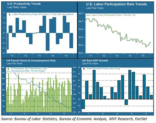
Labor force participation (upper right area of chart) has been in steep decline for the past five years – an outcome of both the jobs lost from the 2007-09 recession and the retirement of baby boomers from the workplace. This decline has helped keep the headline unemployment rate low (blue line in the bottom left chart) and also explains in part the anemic growth in hourly wages over this period. This trend is unlikely to reverse any time soon. If real GDP growth (bottom right chart) is to return to its pre-recession normal trend line, it will have to come from productivity gains. That is why the current trend in productivity (upper left chart) is of such concern.
Of Smartphones and Sewage
The last sustained productivity surge we experienced was in the late 1990s. It is attributed largely to the fruits of the Information Age – the period when the innovations in computing and automation of the previous decades translated into increased efficiencies in the workplace. From 1995 to 2000, quarterly productivity gains averaged 2.6 percent on an annual basis. The pace slackened in the first decade of the current century. In the first five years of this decade – from 2010 to the present – average quarterly productivity growth amounted to just 0.6 percent – more than three times slower than the gains of the late 1990s.
Is that all we can expect from the Smartphone Age? Or are we simply in the middle of an innovation gap – a period in between technological breakthroughs and the translation of those breakthroughs to actual results? It is possible that a new growth age is just around the corner, powered by artificial intelligence, virtual reality and the Internet of Things, among other inventions. It is also possible that the innovations of our day simply don’t pack the same punch as those of other ages. Economist Robert Gordon makes a version of this argument in his recent book, The Rise and Fall of American Growth. Gordon points to the extraordinary period of growth our country experienced from 1870 to 1970 – growth delivered largely thanks to the inventions of electricity and the internal combustion engine – and argues that this was a one-off anomaly that we should not expect to continue indefinitely. What would you rather live without – your Twitter feed and Uber app, or indoor plumbing?
We don’t necessarily agree with Gordon’s conclusion that nothing will ever again rival electricity and motorized transport as an economic growth driver. But we do believe that the growth equation is currently stuck, and the headline data we have seen so far this year do nothing to indicate its becoming unstuck. Long-term growth is not something that drives day-to-day fluctuations in asset prices. But its absence is a problem that is increasingly part of the conversation about where markets go from here. Stay tuned for more Productivity Wednesdays.
Is The US Federal Reserve Bank About To Commit The Sin Of Pride?
Summary
- The Fed Funds Futures say a December 2015 rate raise is a near sure thing at 74%.
- Many major currencies are down substantially against the USD in the last 1-2 years. This is hurting exports. It is costing jobs.
- A raise of the Fed Funds rate will lead to a further appreciation of the USD. That hurt exports more; and it will cost the US more jobs.
- A raise of the Fed Funds rate will also lead to an automatic cut to the GDP’s of Third World and Emerging Market nations, which are calculated in USD’s.
- There will likely be a nasty downward economic spiral effect that no one wants in Third World countries, Emerging Market countries, and in the US.
The Fed Funds Futures, which are largely based on statements from the Fed Presidents/Governors, are at 74% for a December 2015 raise as of November 26, 2015. This is up from 50% at the end of October 2015. If the Fed does raise the Fed Funds rate, will the raise have a positive effect or a negative one? Let’s examine a few data points.
First raising the Fed Funds rate will cause the value of the USD to go up relative to other currencies. It is expected that a Fed Funds rate raise will cause a rise in US Treasury yields. This means US Treasury bond values will go down at least in the near term. In the near term, this will cost investors money. However, the new higher yield Treasury notes and bonds will be more attractive to investors. This will increase the demand for them. That is the one positive. The US is currently in danger that demand may flag if a lot of countries decide to sell US Treasuries instead of buying them. The Chinese say they are selling so that they can defend the yuan. Their US Treasury bond sales will put upward pressure on the yields. That will in turn put upward pressure on the value of the USD relative to other currencies.
So far the Chinese have sold US Treasuries (“to defend the yuan”); but they have largely bought back later. Chinese US Treasuries holdings were $1.2391T as of January 2015. They were $1.258T as of September 2015. However, if China decided to just sell, there would be significant upward pressure on the US Treasury yields and on the USD. That would make China’s and other countries products that much cheaper in the US. It would make US exports that much more expensive. It would mean more US jobs lost to competing foreign products.
To better assess what may or may not happen on a Fed Funds rate raise, it is appropriate to look at the values of the USD (no current QE) versus the yen and the euro which have major easing in progress. Further it is appropriate to look at the behavior of the yen against the euro, where both parties are currently easing.
The chart below shows the performance of the euro against the USD over the last two years.
(click to enlarge)
The chart below shows the performance of the Japanese yen against the USD over the last two years.
(click to enlarge)
As readers can see both charts are similar. In each case the BOJ or the ECB started talking seriously about a huge QE plan in the summer or early fall of 2014. Meanwhile the US was in the process of ending its QE program. It did this in October 2014. The results of this combination of events on the values of the two foreign currencies relative to the USD are evident. The value of the USD went substantially upward against both currencies.
The chart below shows the performance of the euro against the Japanese yen over the last two years.
(click to enlarge)
As readers can see the yen has depreciated versus the euro; but that depreciation has been less than the depreciation of the yen against the USD and the euro against the USD. Further the amount of Japanese QE relative to its GDP is a much higher at roughly 15%+ per year than the large ECB QE program that amounts to only about 3%+ per year of effectively “printed money”. The depreciation of the yen versus the euro is the result that one would expect based on the relative amounts of QE. Of course, some of the strength of the yen is due to the reasonable health of the Japanese economy. It is not just due to QE amount considerations. The actual picture is a complex one; and readers should not try to over simplify it. However, they can generally predict/assume trends based on the macro moves by the BOJ, the ECB, and the US Fed.
The chart below shows the relative growth rates of the various central banks’ assets.
(click to enlarge)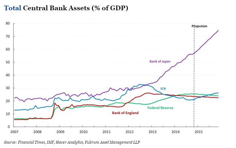
As readers can see, this chart makes it appear that Japan is in trouble relative to the other countries. When this situation will explode (implode) into a severe recession for Japan is open to question. That is not the theme of this article, so I will not speculate here. Still it is good to be aware of the relative situation. Japan is clearly monetizing its debts relative to the other major currencies. That likely means effective losses in terms of “real” assets for the other countries. It means Japan is practicing mercantilism against its major competitors to a huge degree. Do the US and other economies want to allow this to continue unabated? Theoretically that means they are allowing Japanese workers to take their jobs unfairly.
I will not try to include the Chinese yuan in the above description, since it has not been completely free floating. Therefore the data would be distorted. However, the yuan was allowed to fall against other major currencies by the PBOC in the summer of 2015. In essence China is participating in the major QE program that many of the world’s central banks seem to be employing. It has also been steadily “easing” its main borrowing rate for more than a year now from 6.0% before November 23, 2014 to 4.35% after its latest cut October 23, 2015. It has employed other easing measures too. I have omitted them for simplicity’s sake. Many think China will continue to cut rates in 2016 and beyond as the Chinese economy continues to slow.
All of these countries are helping their exports via mercantilism by effectively devaluing their currencies against the USD. The table below shows the trade data for US-China trade for 2015.
(click to enlarge)
As readers can see in the table above the US trade deficit popped up in the summer about the time China devalued the yuan. Some of this pop was probably seasonal; but a good part of it was almost certainly not seasonal. This means the US is and will be losing more jobs in the future to China (and perhaps other countries), if the US does not act to correct/reverse this situation.
The US Total Trade Deficit has also been going up.
⦁ For January-September 2013, the deficit was -$365.3B.
⦁ For January-September 2014, the deficit was -$380.0B.
⦁ For January-September 2015, the deficit was -$394.9B.
The US Total Trade Deficit has clearly been trending upward. The lack of QE by the US for the last year plus and the massive QE by the US’ major trade partners is making the situation worse. The consequently much higher USD has been making the situation worse. The roughly -$30B increase in the US Total Trade Deficit for the first nine months of the year from 2013 to 2015 means the US has been paying US workers -$30B less than it would have if the level of the deficit had remained the same. If the deficit had gone down, US workers would have benefited even more.
If you take Cisco Systems (NASDAQ:CSCO) as an example, it had trailing twelve month revenue of $49.6B as of its Q3 2015 earnings report. That supported about 72,000 jobs. CSCO tends to pay well, so those would be considered “good” jobs. Adjusting for three fourths of the year and three fifths of the amount of money (revenue), this amounts to roughly -57,000 well paying jobs that the US doesn’t have due to the extra deficit. If I then used the multiplier effect from the US Department of Commerce for Industrial Machinery and Equipment jobs of 9.87, that would translate into over -500,000 jobs lost. Using that logic the total trade deficit may account for more than -5 million jobs lost. Do US citizens really want to see their jobs go to foreign countries? Do US citizens want to slowly “sell off the US”? How many have seen the Chinese buying their houses in California?
The US Fed is planning to make that situation worse. A raise of the Fed Funds rate will lead directly to a raise in the yield on US Treasuries. It will lead directly to a stronger USD. That will translate into an even higher US trade deficit. That will mean more US jobs lost. Who thinks that will be good for the US economy? Who thinks the rate of growth of the US trade deficit is already too high? When you consider that oil prices are about half what they were a year and a half ago, you would think that the US Trade Deficit should not even be climbing. Yet it has, unabated. That bodes very ill for the US economy for when oil prices start to rise again. The extra level of non-oil imports will not disappear when oil prices come back. Instead the Total Trade Deficit will likely spike upward as oil prices double or more. Ouch! That may mean an instant recession, if we are not already there by then. Does the US Fed want to make the already bad situation worse?
Consider also that other countries use the USD as a secondary currency, especially South American and Latin American countries. Their GDP’s are computed in USD’s. Those currencies have already shown weakness in recent years. One of the worse is Argentina. It has lost almost -60% of its value versus the USD over the last five years (see chart below).
(click to enlarge)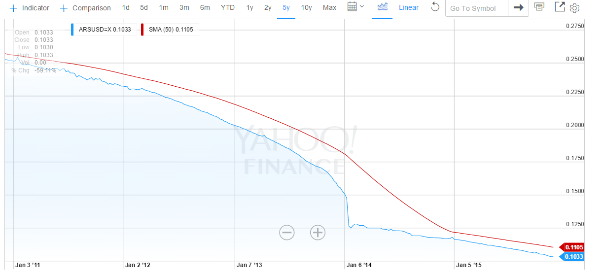
The big drop in January 2014 was when the government devalued its currency from 6 pesos to the USD to 8 pesos to the USD. If the Fed causes the USD to go up in value, that will lead to an automatic decrease in the Argentine GDP in USD terms. Effectively that will lead to an automatic cut in pay for Argentine workers, who are usually paid in pesos. It will cause a more rapid devaluation of the Argentine peso due to the then increased scarcity of USD’s with which to buy imports, etc. Remember also that a lot of goods are bought with USDs in Argentina because no one has any faith in the long term value of the Argentine peso. Therefore a lot of Argentine retail and other trade is done with USD’s. The Fed will immediately make Argentinians poorer. Labor will be cheaper. The cost of Argentine exports will likely go down. The US goods will then have even more trouble competing with cheaper Argentine goods. That will in turn hurt the US economy. Will that then cause a further raise to the US Treasury yields in order to make them more attractive to buyers? There is that possibility of a nasty spiral in rates upward that will be hard to stop. Further the higher rates will increase the US Budget Deficit. Higher taxes to combat that would slow the US economy further. Ouch! The Argentine scenario will likely play out in every South American and Latin American country (and many other countries around the world). Is this what the Fed really wants to accomplish? Christine Lagarde (head of the IMF) has been begging them not to do this. Too many Third World and Emerging Market economies are already in serious trouble.
Of course, there is the argument that the US has to avoid inflation; but how can the US be in danger of that when commodities prices are so low? For October export prices ex-agriculture and import prices ex-oil were both down -0.3%. The Core PPI was down -0.3%. Industrial Production was down -0.2%. The Core CPI was only up + 0.2%. The Core PCE Prices for October were unchanged at 0.0%. Isn’t that supposed to be one of the Fed’s favorite inflation gauges? Personal Spending was only up +0.1%, although Personal Income was up +0.4%. I just don’t see the inflation the Fed seems to be talking about. Perhaps when oil prices start to rise again, it will be time to raise rates. However, when there are so many arguments against raising rates, why would the Fed want to do so early? It might send the US economy into a recession. It would only increase the rate of rise of the US Trade Deficit and the US Budget Deficit. It would only hurt Third World and Emerging Market economies.
Of course, there is the supposedly full employment argument. However, the article, “20+ Reasons The Fed Won’t Raise Even After The Strong October Jobs Number” contains a section (near the end of the article) that explains that the US employment rate is actually 10.8% relatively to the level of employment in 2008 (before the Great Recession). The US has not come close to recovering from the Great Recession in terms of jobs; and for the US Fed or the US government to pretend that such a recovery has occurred is a deception of US citizens. I am not talking about the U6 number for people who are only partially employed. If I were, the unemployment number would be roughly 15%. I am merely adding in all of the people who had jobs in 2008, who are no longer “in the work force” because they have stopped “looking for jobs” (and therefore not in the unemployment number calculation). The unemployment number the government and the Fed are citing is a farce if you are talking about the 2008 employment level; and people should recognize this. The Fed should also be recognizing this when they are making decisions based on the unemployment level. Political posturing by Democrats (Obama et al) to improve the Democratic performance in the 2016 elections will only have a negative impact on the US economy. There is no “full employment” at the moment.
We all know that the jobs numbers are usually good due to the Christmas season. Some say those jobs don’t count because they are all part time. However, a lot of businesses hire full time temporarily. Think of all of those warehouse jobs for e-commerce. Do you think they want to train more people to work part time? Or do you think they want to train fewer people to work perhaps even more than full time? Confusion costs money. It slows things down. Fewer new people is often the most efficient way to go. A lot of the new jobs for the Christmas season are an illusion. They will disappear come late January 2016. Basing a Fed Funds rate raise on Christmas season hiring is again a mistake that will cost the US jobs in the longer term. If the Fed does this, it will be saying that the US economy exists in a US vacuum. It will be saying that the US economy is unaffected by the economies of the rest of the world. Remember the latest IMF calculation for the world economic outlook for FY2015 was cut in October 2015 to +3.1% GDP Growth. This is -0.2% below the IMF’s July 2015 estimate and -0.3% below FY2014. If the world economic growth outlook is falling, is it at all reasonable to think that US economic growth will be so high as to cause significant inflation? Is it instead more reasonable to think that a higher Fed Funds rate, higher Treasury yields, and a more highly valued USD will cause the US economy to slow further as would be the normal expectation? Does the Fed want to cause STAGFLATION?
If the Fed goes through with their plan to raise rates in December 2015, they will be committing the Sin Of Pride. That same sin is at least partially responsible for the US losing so many of its jobs to overseas competitors over the last 50 years. One could more logically argue that the Fed should be instituting its own QE program in order to combat the further lost of US jobs to the mercantilist behaviors of its trade partners. The only reason not to do this is that it believes growing its balance sheet will be unhealthy in the long run. However, the “Total Central Bank Assets (as a % of GDP)” chart above shows that the US is lagging both the ECB and the BOJ in the growth of its balance sheet. In other words our major competitors are monetizing their debts at a faster rate than we are. You could argue that someone finally has to stop this trend. However, the logical first step should be not adding to the central banks’ asset growth. Reversing the trend should not be attempted until the other major central banks have stopped easing measures. Otherwise the US Fed is simply committing the SIN OF PRIDE; and as the saying goes, “Pride goeth before a fall”. There are a lot of truisms in the Bible (Proverbs). It is filled with the wisdom of the ages; and even the Fed can benefit from its lessons. Let’s hope they do.
by David White in Seeking Alpha
These Are the Top 20 Cities Americans Are Ditching
Soaring costs of living meant residents left New York City and its suburbs in droves.

Erin Roman and Wei Lu in Bloomberg News
New York City, Los Angeles, Honolulu: They’re all places you would think would be popular destinations for Americans. So it might come as a surprise that these are among the cities U.S. residents are fleeing in droves.
The map below shows the 20 metropolitan areas that lost the greatest share of local people to other parts of the country between July 2013 and July 2014, according to a Bloomberg News analysis of U.S. Census Bureau data. The New York City area ranked 2nd, losing about a net 163,000 U.S. residents, closely followed by a couple surrounding suburbs in Connecticut. Honolulu ranked fourth and Los Angeles ranked 14th. The Bloomberg calculations looked at the 100 most populous U.S. metropolitan areas.

Interestingly, these are also the cities with some of the highest net inflows of people from outside the country. That gives many of these cities a steadily growing population, despite the net exodus of people moving within the U.S.
So what’s going on here? Michael Stoll, a professor of public policy and urban planning at the University of California Los Angeles, has an idea. Soaring home prices are pushing local residents out and scaring away potential new ones from other parts of the country, he said. (Everyone knows how unaffordable the Manhattan area has become.)
And as Americans leave, people from abroad move in to these bustling cities to fill the vacant low-skilled jobs. They are able to do so by living in what Stoll calls “creative housing arrangements” in which they pack six to eight individuals, or two to four families, into one apartment or home. It’s an arrangement that most Americans just aren’t willing to pursue, and even many immigrants decide it’s not for them as time goes by, he said.
In addition, the growing demand for high-skilled workers, especially in the technology industry, brought foreigners who possess those skills to the U.S. They are compensated appropriately and can afford to live in these high-cost areas, just like Americans who hold similar positions. One example is Washington, D.C., which had a lot of people from abroad arriving to soak up jobs in the growing tech-hub, Stoll said.
Other areas weren’t so lucky. Take some of the Rust Belt cities that experienced fast drops in their American populations, like Cleveland, Dayton and Toledo, even though they are relatively inexpensive places to live. These cities didn’t get enough international migrants to make up for the those who left, a reflection of the fact that locals were probably leaving out of a lack of jobs.
This is part of a multiple-decade trend of the U.S. population moving away from these manufacturing hubs to areas in the Sun Belt and the Pacific Northwest, Stoll said. Retiring baby boomers are also leaving the Northeast and migrating to more affordable places with better climates.
This explains why the majority of metropolitan areas in Florida and Texas, as well as west-coast cities like Portland, had an influx of people.
El Paso, Texas, the city that residents fled from at the fastest pace, also saw a surprisingly small number of foreigners settling in given how close it is to Mexico.
“A lot of young, reasonably educated people are having a hard time finding work there,” Stoll said. “They’re not staying in town after they graduate,” leaving for the faster-growing economies of neighboring metro areas like Dallas and Austin, he said.
Methodology: Bloomberg ranked 100 of the most populous U.S. metropolitan areas based on their net domestic migration rates, from July 1, 2013 to July 1, 2014, as a percentage of total population as of July 2013. Domestic migration refers to people moving within the country (e.g. someone moving from New York City to San Francisco). A negative rate indicates more people leaving than coming in. International migration refers to a local resident leaving for a foreign country or someone from outside the U.S. moving into the U.S.
One Third Of U.S. Companies’ Q1 Job Cuts Due To Oil Prices
 by Olivia Pulsinelli
Oil prices caused one-third of the job cuts that U.S.-based companies announced in the first quarter, according to a new report. March was the fourth month in a row to record a year-over-year increase in job cuts, Chicago-based outplacement consultancy Challenger, Gray & Christmas Inc. reports. And 47,610 of the 140,214 job cuts announced between January and March were directly attributed to falling oil prices. Not surprisingly, the energy sector accounted for 37,811 of the job cuts — up a staggering 3,900 percent from the same quarter a year earlier, when 940 energy jobs were cut. However, U.S. energy firms only announced 1,279 job cuts in March, down about 92 percent from the 16,339 announced in February and down nearly 94 percent from the 20,193 announced in January. The trend held true in Houston, where several energy employers announced job cuts in January and February, while fewer cuts were announced in March. Overall job-cut announcements are declining, as well. U.S. employers announced 36,594 job cuts in March, down 27.6 percent from the 50,579 announced in February and down 31 percent from the 53,041 announced in January. In December, 32,640 job cuts were announced. “Without these oil related cuts, we could have been looking one of lowest quarters for job-cutting since the mid-90s when three-month tallies totaled fewer than 100,000. However, the drop in the price of oil has taken a significant toll on oil field services, energy providers, pipelines, and related manufacturing this year,” John Challenger, CEO of Challenger, Gray & Christmas, said in a statement.
The U.S. Oil Boom Is Moving To A Level Not Seen In 45 Years
Peak U.S. oil production is a ‘moving target’
SAN FRANCISCO (MarketWatch) — U.S. oil production is on track to reach an annual all-time high by September of this year, according to Rystad Energy. If production does indeed top out, then supply levels may soon hit a peak as well. That, in turn, could lead to shrinking supplies. The oil-and-gas consulting-services firm estimates an average 2015 output of 9.65 million barrels a day will be reached in five months — topping the previous peak annual reading of 9.64 million barrels a day in 1970. Coincidentally, the nation’s crude inventories stand at a record 471.4 million barrels, based on data from U.S. Energy Information Administration, also going back to the 1970s. The staggering pace of production from shale drilling and hydraulic fracturing have been blamed for the 46% drop in crude prices CLK5, -1.08% last year. But reaching so-called peak production may translate into a return to higher oil prices as supplies begin to thin.
 Rystad Energy’s estimate includes crude oil and lease condensate (liquid hydrocarbons that enter the crude-oil stream after production), and assumes an average price of $55 for West Texas Intermediate crude oil. May WTI crude settled at $49.14 a barrel on Friday. The forecast peak production level in September is also dependent on horizontal oil rig counts for Bakken, Eagle Ford and Permian shale plays stabilizing at 400 rigs, notes Per Magnus Nysveen, senior partner and head of analysis at Rystad. Of course, in this case, hitting peak production isn’t assured. “Some will be debating whether the U.S. has reached its peak production for the current boom, without addressing the question of what level will U.S. production climb to in any future booms,” said Charles Perry, head of energy consultant Perry Management. “So one might also say U.S. peak production is a moving target.” James Williams, an energy economist at WTRG Economics, said that by his calculations, peak production may have already happened or may occur this month, since the market has seen a decline in North Dakota production, with Texas expected to follow.
Permian Basin Idles Five Rigs This Week

The number of rigs exploring for oil and natural gas in the Permian Basin decreased five this week to 285, according to the weekly rotary rig count released Thursday by Houston-based oilfield services company Baker Hughes.
The North American rig count was released a day early this week because of the Good Friday holiday, according to the Baker Hughes website.
District 8 — which includes Midland and Ector counties — shed four rigs, bringing the total to 180. The district’s rig count is down 42.68 percent on the year. The Permian Basin is down 46.23 percent.
At this time last year, the Permian Basin had 524 rigs.
TEXAS
Texas’ count fell six this week, leaving 456 rigs statewide.
In other major Texas basins, there were 137 rigs in the Eagle Ford, unchanged; 29 in the Haynesville, down three; 23 in the Granite Wash, down one; and six in the Barnett, unchanged.
Texas had 877 rigs a year ago this week.
UNITED STATES
The number of rigs in the U.S. decreased 20 this week, bringing the nationwide total to 1,028.
There were 802 oil rigs, down 11; 222 natural gas rigs, down 11; and four rigs listed as miscellaneous, up two.
By trajectory, there were 136 vertical rigs, down eight; 799 horizontal rigs, down 13; and 93 directional rigs, up one. The last time the horizontal rig count fell below 800 was the week ending June 4, 2010, when Baker Hughes reported 798 rigs.
There were 993 rigs on land, down 17; four in inland waters, unchanged; and 31 offshore, down three. There were 29 rigs in the Gulf of Mexico, down four.
The U.S. had 1,818 rigs at this time last year.
TOP 5s
The top five states by rig count this week were Texas; Oklahoma with 129, down four; North Dakota with 90, down six; Louisiana with 67, down five; and New Mexico with 51, unchanged.
The top five rig counts by basin were the Permian; the Eagle Ford; the Williston with 91, down six; the Marcellus with 70, unchanged; and the Cana Woodford and Mississippian with 40 each. The Mississippian idled three rigs, while the Cana Woodford was unchanged. The Cana Woodford shale play is located in central Oklahoma.
CANADA AND NORTH AMERICA
The number of rigs operating in Canada fell 20 this week to 100. There were 20 oil rigs, up two; 80 natural gas rigs, down 22; and zero rigs listed as miscellaneous, unchanged.
The last time Canada’s rig count dipped below 100 was the week ending May 29, 2009, when 90 rigs were reported.
Canada had 235 rigs at this time last year.
The total number of rigs in the North America region fell 40 this week to 1,128. North America had 2,083 rigs a year ago this week.
Another Dubious Jobs Report
Source: Prison Planet

According to the payroll jobs report today (March 6) the economy created 295,000 new jobs in February, dropping the rate of unemployment to 5.5%. However, the BLS also reported that the labor force participation rate fell and the number of people not in the labor force rose by 354,000.
In other words, the unemployment rate dropped because the labor force shrunk.
If the economy was in recovery, the labor force would be growing and the labor force participation rate would be rising.
The 295,000 claimed new jobs are highly suspect. For example, the report claims 32,000 new retail jobs, but the Census Bureau reports that retail sales declined in December and January. Why would retailers experiencing declining sales hire more employees?
Construction spending declined 1.1% in January, but the payroll jobs report says 29,000 construction jobs were added in February.
Zero Hedge reports that the decline in the oil price has resulted in almost 40,000 laid off workers during January and February, but the payroll jobs report only finds 2,900 lost jobs in oil for the two months.http://www.zerohedge.com/news/2015-03-06/did-bls-once-again-forget-count-tens-thousands-energy-job-losses
There is no sign in the payroll jobs report of the large lay-offs by IBM and Hewlett Packard.
These and other inconsistencies do not inspire confidence.
By ignoring the inconsistencies the financial press does not inspire confidence.
Let’s now look at where the BLS says the payroll jobs are.

All of the goods producing jobs are accounted for by the 29,000 claimed construction jobs. The remaining 259,000 new jobs–90%–of the total–are service sector jobs. Three categories account for 70% of these jobs. Wholesale and retail trade, transportation and utilities account. for 62,000 of the jobs. Education and health services account for 54,000 of which ambulatory health care services accounts for 19,900. Leisure and hospitality account for 66,000 jobs of which waitresses and bartenders account for 58,700 jobs.
These are the domestic service jobs of a turd world country.
John Williams (shadowstats.com) reports: “As of February, the level of full-time employment still was 1.0 million shy of its pre-recession peak.”
Paul Craig Roberts was Assistant Secretary of the Treasury for Economic Policy and associate editor of the Wall Street Journal. He was columnist for Business Week, Scripps Howard News Service, and Creators Syndicate. He has had many university appointments. His internet columns have attracted a worldwide following. His latest book, The Failure of Laissez Faire Capitalism and Economic Dissolution of the West is now available.
20 Stunning Facts About Energy Jobs In The US
 by Tyler Durden
For all those who think the upcoming carnage to the shale industry will be “contained” we refer to the following research report from the Manhattan Institute for Policy Research:
- The United States is now the world’s largest and fastest-growing producer of hydrocarbons. It has surpassed Saudi Arabia in combined oil and natural gas liquids output and has now surpassed Russia, formerly the top producer, in natural gas. [ZH: that’s about to change]
- The increased production of domestic hydrocarbons not only employs people directly but also radically reduces the drag on growth and job formation associated with America’s trade deficit.
- As the White House Council of Economic Advisers noted this past summer: “Every barrel of oil or cubic foot of gas that we produce at home instead of importing abroad means more jobs, faster growth, and a lower trade deficit.” [the focus now is not on the oil produced at home, which is set to plunge, but the consumer “tax cut” from plunging oil prices]
- Since 2003, more than 400,000 jobs have been created in the direct production of oil & gas and some 2 million more in indirect employment in industries such as transportation, construction, and information services associated with finding, transporting, and storing fuels from the new shale bounty.
- All told, about 10 million Americans are employed directly and indirectly in a broad range of businesses associated with hydrocarbons.
- There are 16 states with more than 150,000 people employed in hydrocarbon-related activities. Even New York, which continues to ban the production of shale oil & gas, is seeing job benefits in a range of support and service industries associated with shale development in adjacent Pennsylvania.

- Direct employment in the oil & gas industry had been declining for 30 years but has recently reversed course, with the availability of new technologies to develop shale fields. Nearly 300,000 direct oil & gas jobs have been created following the 2003 nadir in that sector’s direct employment.
- The five super-major oil companies—Exxon, BP, Chevron, Shell, Conoco—that operate in the U.S. account for only 10 percent of Americans working directly in the oil & gas business.
- Meanwhile, more than 20,000 other firms are directly involved in the oil & gas industry, and they produce over 75 percent of America’s oil & gas output. The median independent oil & gas firm has fewer than 15 employees. (Note that these data exclude gasoline stations, which employ nearly 1 million people and are overwhelmingly owned by individuals or small businesses.)
- As in the oil & gas industry, most Americans are employed by firms with fewer than 500 employees. Small businesses not only employ half of all American workers but also generate nearly half the nation’s economic output. Young firms tend to be small firms; and young firms tend to emerge disproportionately in areas of rapid growth or new opportunities—such as in and around America’s shale fields.

- A broad array of small and midsize oil & gas companies are propelling record economic and jobs gains—not just in the oil fields but across the economy. The enormous expansion in employment, exports, and tax revenues from the domestic oil & gas revolution is largely attributable to a core and defining feature of America: small businesses.
- The oil & gas sector boom creates “induced” and energy-related jobs. For every direct job, there are, on average, three jobs created in industries such as housing, retail, education, health care, food services, manufacturing, and construction.
- In the 10 states at the epicenter of oil & gas growth, overall statewide employment gains have greatly outpaced the national average. There we see the ripple-out effect on overall (not just oil & gas) employment. The shale boom’s broad jobs benefits are most visible in North Dakota and Texas, of course, where overall state employment growth in all sectors has vastly outpaced U.S. job recovery. Similarly, in the other states that have experienced recent growth in hydrocarbon production—notably, Pennsylvania, Colorado, Louisiana, Oklahoma, Wyoming—statewide overall (again, not just oil & gas) employment growth has also outpaced the U.S. recovery.
- In addition to the direct and induced jobs, America is beginning to see the economic and jobs impact of a renaissance in energy-intensive parts of the manufacturing sector, from plastics and chemicals to fertilizers. Examples include an Egyptian firm planning a $1 billion fertilizer plant in Iowa and a South Korean tire company with an $800 million plan for a Tennessee plant. Germany’s BASF recently announced expansion of its American investments, including production and research. BASF calculated that its German operations’ energy bill would be $700 million a year lower if it could pay American prices for energy
- The Marcellus shale fields in Pennsylvania were responsible for enabling statewide double-digit job growth in 2010 and 2011 and now account for more than one-fifth of that state’s manufacturing jobs. For every $1 that the Marcellus industry spends in the state, $1.90 of total economic output is generated.
- The typical wage effect of the oil & gas revolution is most clearly visible in Texas. In the 23 counties atop the Eagle Ford shale, average wages for all citizens have grown by 14.6 percent annually since 2005, compared with the 6.8 and 6.3 percent average for Texas and the U.S., respectively, over the same period. The top five counties in the Eagle Ford shale have experienced an average 63 percent annual rate of wage growth. These are the kinds of wage effects sought in every state and by every worker.

- Given the persistent, slow job recovery from the Great Recession, there could not be a more important time in modern history to find ways to foster more small businesses of all kinds, given that they are not only the core engine for growth but also frequently grow rapidly.

Punchline #1:
- The $300–$400 billion overall annual economic gain from the oil & gas boom has been greater than the average annual GDP growth of $200–$300 billion in recent years—in other words, the economy would have continued in recession if it were not for the unplanned expansion of the oil & gas sector.
Punchline #2:
- Hydrocarbon jobs have provided a greater single boost to the U.S. economy than any other sector, without requiring any special taxpayer subsidies—instead generating tax receipts from individual incomes and business growth.
And the final punchline:
- The National Association of Manufacturers estimated that the shale revolution will lead to 1 million manufacturing jobs over the coming decade. Manufacturing jobs pay nearly 30 percent more than the industrial average and generate $1.48 of economic activity for every $1 spent, making manufacturing the highest economic multiplier of all industrial sectors.
Sorry, not anymore.

Now, thanks to John Kerry’s “secret pact“, and America’s close “ally” in the middle-east, Saudi Arabia whose “mission” it no longer to bankrupt Russia but to crush America’s shale industry, the only question surround the only bright spot for America’s economy over the past 6 years is how long before most of the marginal producers file Chapter 11, or 7.
“Houston, You Have A Problem” – Texas Is Headed For A Recession Due To Oil Crash, JPM Warns

by Tyler Durden
It was back in August 2013, when there was nothing but clear skies ahead of the US shale industry that we asked “How Much Is Oil Supporting U.S. Employment Gains?” The answer we gave:
The American Petroleum Institute said last week the U.S. oil and natural gas sector was an engine driving job growth. Eight percent of the U.S. economy is supported by the energy sector, the industry’s lobbying group said, up from the 7.7 percent recorded the last time the API examined the issue. The employment assessment came as the Energy Department said oil and gas production continued to make gains across the board. With the right energy policies in place, API said the economy could grow even more. But with oil and gas production already at record levels, the narrative over the jobs prospects may be failing on its own accord…. The API’s report said each of the direct jobs in the oil and natural gas industry translated to 2.8 jobs in other sectors of the U.S. economy. That in turn translates to a total impact on U.S. gross domestic product of $1.2 trillion, the study found.
Two weeks ago we followed up with an article looking at “Jobs: Shale States vs Non-Shale States” in which we showed the following chart:
And added the following:
According to a new study, investments in oil and gas exploration and production generate substantial economic gains, as well as other benefits such as increased energy independence. The Perryman Group estimates that the industry as a whole generates an economic stimulus of almost $1.2 trillion in gross product each year, as well as more than 9.3 million permanent jobs across the nation.
The ripple effects are everywhere. If you think about the role of oil in your life, it is not only the primary source of many of our fuels, but is also critical to our lubricants, chemicals, synthetic fibers, pharmaceuticals, plastics, and many other items we come into contact with every day. The industry supports almost 1.3 million jobs in manufacturing alone and is responsible for almost $1.2 trillion in annual gross domestic product. If you think about the law, accounting, and engineering firms that serve the industry, the pipe, drilling equipment, and other manufactured goods that it requires, and the large payrolls and their effects on consumer spending, you will begin to get a picture of the enormity of the industry.

Another way of visualizing the impact of the shale industry on the US economy comes courtesy of this chart from the Manhattan Institute which really needs no commentary:

The Institute had this commentary to add:
The jobs recovery since the 2008 recession has been the slowest of any post recession recovery in the U.S. since World War II. The number of people employed has yet to return to the 2007 level. The country has suffered a deeper and longer-lasting period of job loss than has followed any of the ten other recessions since 1945.
There has, however, been one employment bright spot: jobs in America’s oil & gas sector and related industries. Since 2003, more than 400,000 jobs have been created in the direct production of oil & gas and some 2 million more in indirect employment in industries such as transportation, construction, and information services associated with finding, transporting, and storing fuels from the new shale bounty.
In addition, America is seeing revitalized growth and jobs in previously stagnant sectors of the economy, from chemicals production and manufacturing to steel and even textiles because of access to lower cost and reliable energy.
The surge in American oil & gas production has become reasonably well-known; far less appreciated are two key features, which are the focus of this paper: the widespread geographic dispersion of the jobs created; and the fact that the majority of the jobs have been created not in the ranks of the Big Oil companies but in small businesses, even more widely dispersed.
Fast forward to today when we are about to learn that Newton’s third law of Keynesian economics states that every boom, has an equal and opposite bust.
Which brings us to Texas, the one state that more than any other, has benefited over the past 5 years from the Shale miracle. And now with crude sinking by the day, it is time to unwind all those gains, and give back all those jobs. Did we mention: highly compensated, very well-paying jobs, not the restaurant, clerical, waiter, retail, part-time minimum-wage jobs the “recovery” has been flooded with.
Here is JPM’s Michael Feroli explaining why Houston suddenly has a very big problem.
- In less than five years Texas’ share of US oil production has gone from around 25% to over 40%
- By some measures, the oil intensity of the Texas economy looks similar to what it was in the mid-1980s
- The 1986 collapse in oil prices led to a painful regional recession in Texas
- While the rest of the country looks to benefit from cheap oil, Texas could be headed for recession
The collapse in oil prices will create winners and losers, both globally and here in the US. While we expect the country, overall, will be a net beneficiary from falling oil prices, two states look like they will bear the brunt of the pain: North Dakota and Texas. Given its much larger size, the prospect of a recession in Texas could have some broader reverberations.
By now, most people are familiar with the growth of the fossil fuel industry in places like Pennsylvania and Ohio. However, that has primarily been a natural gas story. The renaissance of US crude oil production has been much more concentrated: over 90% of the growth in the past five years has been in North Dakota and Texas; with Texas alone accounting for 67% of the increase in the nation’s crude output over that period.
In the first half of 1986, crude oil prices fell just over 50%. At the end of 1985, the unemployment rate in Texas was equal to that in the nation as a whole; at the end of 1986 it was 2.6%- points higher than the national rate. There are some reasons to think that it may not be as bad this time around, but there are even better reasons not to be complacent about the risk of a regional recession in Texas.
Geography of a boom
The well-known energy renaissance in the US has occurred in both the oil and natural gas sectors. Some states that are huge natural gas producers have limited oil production: Pennsylvania is the second largest gas producing state but 19th largest oil producer. The converse is also true: North Dakota is the second largest crude producer but 14th largest gas producer. However, most of the economic data as it relates to the energy sector, employment, GDP, etc, often lump together the oil and gas extraction industries. Yet oil prices have collapsed while natural gas prices have held fairly steady. To understand who is vulnerable to the decline in oil prices specifically we turn to the EIA’s state-level crude oil production data.
The first point, mentioned at the outset, is that Texas, already a giant, has become a behemoth crude producer in the past few years, and now accounts for over 40% of US production. However, there are a few states for which oil is a relatively larger sector (as measured by crude production relative to Gross State Product): North Dakota, Alaska, Wyoming, and New Mexico. For two other states, Oklahoma and Montana, crude production is important, though somewhat less so than for Texas. Note, however, that these are all pretty small states: the four states where oil is more important to the local economy than Texas have a combined GSP that is only 16% of the Texas GSP. Finally, there is one large oil producer, California, which is dwarfed by such a huge economy that its oil intensity is actually below the national average, and we would expect it, like the country as a whole, to benefit from lower oil prices.
Texas-sized challenges
As discussed above, Texas is unique in the country as a huge economy and a huge oil producer. When thinking about the challenges facing the Texas economy in 2015 it may be useful, as a starting point, to begin with the oil price collapse of 1986. Then, like now, crude oil prices collapsed around 50% in the space of a few short months. As noted in the introduction, the labor market response was severe and swift, with the Texas unemployment rate rising 2.0%-points in the first three months of 1986 alone. Following the hit to the labor market, the real estate market suffered a longer, slower, burn, and by the end of 1988 Texas house prices were down over 14% from their peak in early 1986 (over the same period national house prices were up just over 14%). The last act of this tragedy was a banking crisis, as several hundred Texas banks failed, with peak failures occurring in 1988 and 1989.
How appropriate is it to compare the challenges Texas faces today to the ones they faced in 1986? The natural place to begin is by getting a sense of the relative energy industry intensity of Texas today versus 1986. Unfortunately, the GSP-by-industry data have a definitional break in 1997, but splicing the data would suggest a similar share of the oil and gas sector in Texas GSP now and in 1985: around 11%. Employment in the mining and logging sector (which, in Texas, is overwhelmingly dominated by the oil and gas sector) was around 3.7% in 1985 and is 2.7% now. This is consistent with a point we have been making in the national context: the oil and gas sector is very capital-intensive, and increasingly so. Even so, as the 1986 episode demonstrated, there do seem to be sizable multiplier effects on non-energy employment. Finally, there does not exist capital spending by state data, but at the national level we can see the flip side of the increasing capital intensive nature of energy: oil and gas related cap-ex was 0.58% of GDP in 4Q85, and is 0.98% of GDP now.
Given this, what is the case for arguing that this time is different, and the impact will be smaller than in 1986? One is that now, unlike in 1986, natural gas prices haven’t moved down in sympathy with crude oil prices, and the Texas recession in 1986 may have owed in part also to the decline in gas prices. Another is that, as noted above, the employment share is somewhat lower, and thus the income hit will be felt more by capital-holders – i.e. investors around the country and the world. Finally, unlike 1986, the energy industry is experiencing rapid technological gains, pushing down the energy extraction cost curve.
While these are all valid, they are not so strong as to signal smooth sailing for the Texas economy. Financially, oil is a fair bit more important than gas for Texas, both now and in 1986, with a dollar value two to three times as large. Moreover, while energy employment may be somewhat smaller now, we are not talking about night and day. The current share is about 3/4ths what it was in 1986. (Given the higher capital intensity, there are some reasons to think employment may be greater now in sectors outside the traditional oil and gas sectors, such as pipeline and heavy engineering construction).
As we weigh the evidence, we think Texas will, at the least, have a rough 2015 ahead, and is at risk of slipping into a regional recession. Such an outcome could bring with it the usual collateral damage that occurs in a slowdown. Housing markets have been hot in Texas. Although affordability in Texas looks good compared to the national average, it always does; compared to its own history, housing in some major Texas metro areas looks quite dear, suggesting a risk of a pull-back in the real estate market.
The national economy performed quite well in 1986, in spite of the Texas recession. We expect the US economy will perform well next year too , though some regions – most notably Texas – could significantly under perform the national average.

* * *
So perhaps it is finally time to add that footnote to the “unambiguously good” qualified when pundits describe the oil crash: it may be good for everyone… except Texas which is about to enter a recession. And then Pennsylvania. And then North Dakota. And then Colorado. And then West Virginia. And then Alaska. And then Wyoming. And then Oklahoma. And then Montana, and so on, until finally we find just where the new equilibrium is following the exodus of hundreds of thousands of the best-paying jobs created during the “recovery” offset by minimum-wage waiters, bartenders, retail workers and temps.
The Cruel Injustice of the Fed’s Bubbles in Housing

As the generational war heats up, we should all remember the source of all the bubbles and all the policies that could only result in generational poverty: The Federal Reserve.
Federal Reserve chair Janet Yellen recently treated the nation to an astonishing lecture on the solution to rising wealth inequality–according to Yellen, low-income households should save capital and buy assets such as stocks and housing.
It’s difficult to know which is more insulting: her oily sanctimony or her callous disregard for facts. What Yellen and the rest of the Fed Mafia have done is inflate bubbles in credit and assets that have made housing unaffordable to all but the wealthiest households.
Fed policy has been especially destructive to young households: not only is it difficult to save capital when your income is declining in real terms, housing has soared out of reach as the direct consequence of Fed policies.
Two charts reflect this reality. The first is of median household income, the second is the Case-Shiller Index of housing prices for the San Francisco Bay Area.
I have marked the wage chart with the actual price of a modest 900 square foot suburban house in the S.F. Bay Area whose price history mirrors the Case-Shiller Index, with one difference: this house (and many others) are actually worth more now than they were at the top of the national bubble in 2006-7.
But that is a mere quibble. The main point is that housing exploded from 3 times median income to 12 times median income as a direct result of Fed policies. Lowering interest rates doesn’t make assets any more affordable–it pushes them higher.
The only winners in the housing bubble are those who bought in 1998 or earlier. The extraordinary gains reaped since the late 1990s have not been available to younger households. The popping of the housing bubble did lower prices from nosebleed heights, but in most locales price did not return to 1996 levels.
As a multiple of real (inflation-adjusted) income, in many areas housing is more expensive than it was at the top of the 2006 bubble.
While Yellen and the rest of the Fed Mafia have been enormously successful in blowing bubbles that crash with devastating consequences, they failed to move the needle on household income. Median income has actually declined since 2000.

Inflating asset bubbles shovels unearned gains into the pockets of those who own assets prior to the bubble, but it inflates those assets out of reach of those who don’t own assets–for example, people who were too young to buy assets at pre-bubble prices.

Inflating housing out of reach of young households as a matter of Fed policy isn’t simply unjust–it’s cruel. Fed policies designed to goose asset valuations as a theater-of-the-absurd measure of “prosperity” overlooked that it is only the older generations who bought all these assets at pre-bubble prices who have gained.
In the good old days, a 20% down payment was standard. How long will it take a young family to save $130,000 for a $650,000 house? How much of their income will be squandered in interest and property taxes for the privilege of owning a bubblicious-priced house?
If we scrape away the toxic sludge of sanctimony and misrepresentation from Yellen’s absurd lecture, we divine her true message: if you want a house, make sure you’re born to rich parents who bought at pre-bubble prices.
As the generational war heats up, we should all remember the source of all the bubbles and all the policies that could only result in generational poverty: The Federal Reserve.
